
Sprite Discovery Discussion
Forum Index > PokéFarm > Discussion >


I'm liking the new sprites so far, but I'm having an incredibly hard time seeing Melan Shinxel's nose, I think it's not dark enough, it looks like it just doesn't have a nose.
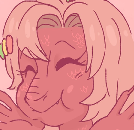
Avatar is my sona, drawn by Saapricots!


 ×7/1000


hi as a fan of shinxel i have some Opinions i would like to discuss bc i did not REALIZE the sprites were getting changes and adrenaline is coursing through me
this is all done in good humor and is not meant as an attack and as such this entire post has the /joke and /lighthearted tone indicators
-smaller ears make sense species wise but are slightly offputting
-why is fluxray bald please give them back their hair,,
-eyebrow markings on shinxel are gone this is the worst day ever
other than that good job!! very cool sprites!! remember this whole post should be taken with the intention if it being lighthearted bc i cant seriously do this for the life of me
they/he
avatar by me

shiny fluxray has eyeliner now and i find that very, very hilarious. in a good way.
- Misc.
- Important Mons


I have nothing againts the revamp in itself, but Shinxel's face looks... flat? Compare to the others two of their line, they miss some lighter shade on their head which make them a bit akward looking.
I also don't really like the new albino and melan, I liked the yellow albino ones since they are rarer compare to purplish or pink albino xD While green doesn't seems to... fits Shinxel really well. Tho it's my personal opinion on it, people can probably get behind green melans.
My first language is french! So sorry in advance for misunderstanding xD
Profile picture made by myself!
Gacha for DCP!


im with rencringe and everyone else on this one, the sprites are cute!! but the small ears remind me of a monkey lol. im not really digging the black tufts on the face, it kinda looks like a beard? i miss when it was markings against the face haha. its nice that it looks less like a recolor but i guess it misses the marks in some places!!
question about a different sprite revamp though, what happened to the apoc. growlithe revamp? putting the link in a hide just in case its a spoiler
the other ones that got revamped first got revealed in the advent calendar but it seems apoc. growlithes advent picture is still the old design. was the new sprite maybe scrapped (which would be a shame!) or is it not going to be released yet?
spoiler?
this from an old pokefarm stream.
☆○o。 。o○☆
wwwwwww
 icon is offical kimetsu no yaiba art
☆○o。 。o○☆
icon is offical kimetsu no yaiba art
☆○o。 。o○☆
icon is offical kimetsu no yaiba art
☆○o。 。o○☆ 
In any other case I'd hate the melan changes to the Shinxel line, but.. I love the melan changes.
I'm a sucker for that cyan/teal-y color and I think it looks really good on them even if I still wouldn't call them 'melanistic'.
QUOTE originally posted by Doduo
I'm liking the new sprites so far[...]
QUOTE originally posted by RenCringe
hi as a fan of shinxel i have some Opinions[...]
QUOTE originally posted by mikestarprince
shiny fluxray has eyeliner now and i find that very, very hilarious. in a good way.
QUOTE originally posted by Nightmøn
I have nothing againts the revamp in itself[...]
QUOTE originally posted by moodawdaw
im with rencringe and everyone else[...]
QUOTE originally posted by FinalAbsolution
In any other case I'd hate the melan changes to the Shinxel line, but.. I love the melan changes.
I'm a sucker for that cyan/teal-y color and I think it looks really good on them even if I still wouldn't call them 'melanistic'.
for those interested, here's the Concept I made for the Shinxel line ALL The way back before Mega Fluxray's debut. The ears were bigger in the concept, which later was made smaller.
Here's a Doodle I did of Fluxray after making the revamped sprites
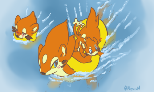 Mama Fluxray an her babes
I believe there was a few questions on Early Bird that some people had before? Sorry for not answering. Its rather late, so pardon for not quoting.
Early Bird
The Eyes:
They were made only slightly bit bigger, funnily enough. They were given that in a small way to make them more wide awake and not totally having the distant look it usually has.
The extra feathers and headcrest
This was to make the design a bit more separate from normal Natu line, where its only difference before was that the normal was practically the Shiny, with a worm in its mouth AND it had a completely different shiny. The extra feathers just reminded me of those cute pictures of adding feathers into your bird's head and the headcrest was just add on to define the eye more (which probably makes it look WIDER than it actually is) but just to further make it different. A simple marking. But would you Also believe me that the base green on This Early Bird IS ACTUALLY the normal Natu Line's green? cause it is =w= so ye, its 'dark' but its also not using the Shiny's colour.
Why Weedle!?
I changed it to a Weedle, mainly due to 'no real animals in Pokemon' that has been semi established by the company over the years since season 1. This is also to tie a couple dex entries that Pokemon still attack and eat other Pokemon. When compariing it to the old sprite we're all used to, yeah it can be a bit jarring.
I.. just picked Weedle cause it stands out the most of the larva Pokemon. Could've done Caterpie, for the same shape, But Caterpie blends in cause it's also green. I did try to make Wurmple, but it made me so mad. So there. Weedle. But also, involving sizes, I took into mind about how the Anime and Pokemon Go have different Sizes for Pokemon. While the average height of Weedle is 1' to Natu's 08" average. Pokemon come in various sizes.
As for the colours between the S/A/M, its Shiny for the Albino and melan so that its a bit different than having a normal Weedle throughout. And Let's be Honest, on PFQ, SHinies are common, 2nd to Normals. It wasn't made to matching because They'd be grabbing for the 1st thing, be VERY unlikely that it would be the same variant type. Purrlion was explaind but Cramorant... I honestly had to go look back, Gen 8 has been like walking through thick fog. But The same idea should be the same for Cramorant, where it grabs the 1st thing and Not for the specific colour variant. So >> It'll likely be relooked at at a later time, much with the edits of a couple other Gen 8 Pokemon that I don't believe got updated yet.
again sorry its late but hope this gives a small bit of clarification? at least to some small extent.
 credits
 Novan-Chan and all forms of her belong to me
Avatar of Novan is made by me for my use only!
@novan-chan thank you for replying! :D it seriously helps
anyway, i understand the ears and tufts better, especially with the concept art. i think that maybe releasing new sprites (revamps, new mons, new forms, etc) with the concept art would be helpful? it helps to show the thought process behind it because being slapped with the final can be a bit scrambling sometimes, seen with how a lot of people jump when new sprites come out including me lol.
about the tufts, i think them in the concept art /are/ really really cute. but i dont think it translated well into the sprite, i think they look a bit odd with them being stuck together. maybe if the two tufts were separated to be more like two whiskers (one single tuft more towards the top of the cheek and one single tuft more more towards the bottom of the cheek), but thats just me, hope thats not too nitpicky lol
i agree with nightmon about the forehead being oddly flat/plain, it works on shinx because its a softer blue and it works on buisel because there is not a lot of open forehead on it, but shinxel is a bright orange with a big forehead which can make it obvious and look almost a bit unfinished, especially when its side-by-side its evos. i wouldnt argue against the forehead-eyebrows being brought back instead of the eyelid-eyebrows but.... the forehead highlight would probably be the only essential change besides also relining the eyelid like you said, i hope you can do so at some point ^^
nightmon explains it good! the regular shinx sprite is not the problem here and doesnt need any change. for shinxel, since orange becomes the black that needs the highlight, shinxel needs the highlight too (if that makes sense!) as well as for the reasons above.
about cramorant and pokemon with the same gimic, i feel like fun should sometimes trump realism. if it catches the first thing it sees, whats stopping the low chance that a regular might find a melanistic? or at least a shiny or albino? i get the logic, but sometimes logic is less enjoyable. i just at the very least dont want cramorant to be changed and im sure others feel the same xD
thank you for answering about the apoc. sprites! im so happy to hear they werent scrapped and im really excited to see the whole set when its done ^__^ (again, i seriously love the new apoc growlithe sprite)
anyways again thanks for replying, it helps to see what the original artists were thinking and i am excited to see more sprites get updated so thank you, cheers!
QUOTE originally posted by Nightmøn
I agree with Moodawdaw, shinx doesn't need to be change. I'll try to explain why too!


 All from the PFQ Pokedex unless precised otherwise
Compare to shinx, shinxel seems to have a smaller head, there is also a lot going on its face compare to shinx sprite. Shinx have an all blue face with big ears and a darker shade who make its face pop up. Luxio and luxray having now black on their face, a lighter shade is added to add more depth.
-cut-
All from the PFQ Pokedex unless precised otherwise
Compare to shinx, shinxel seems to have a smaller head, there is also a lot going on its face compare to shinx sprite. Shinx have an all blue face with big ears and a darker shade who make its face pop up. Luxio and luxray having now black on their face, a lighter shade is added to add more depth.
-cut-
Sprite comparaison!
sprite from platium, since they share the same pose I thought it would make it simplier to compare them
All from the PFQ Pokedex unless precised otherwise

Aw, no, I do rather like the carmorant with the shiny/albino/mlean variant of pikachu line in its mouth. Don't change? Please?
I agree with Moodawdaw, shinx doesn't need to be change. I'll try to explain why too!
All from the PFQ Pokedex unless precised otherwise
Compare to shinx, shinxel seems to have a smaller head, there is also a lot going on its face compare to shinx sprite. Shinx have an all blue face with big ears and a darker shade who make its face pop up. Luxio and luxray having now black on their face, a lighter shade is added to add more depth.
Shinxel doesn't have only one color on its face, it have three, the lighter shade of yellow from buizel and the black "whiskers". These details make it harder to see its face as "round" and it look rather flat instead. The rest of his line doesn't have a color added to their face, yet they have lighter shades on the top of their head, shades who doesn't even appear on buizel line. It work on them, it's making them pop out since they have a bigger head than buizel and floatzel (who doesn't need ligher shades as it could make it harder to see their face xD).
Hope I've sums up my thoughts well! Other than that, I think that their resprite are very good and I can't wait to see how good the others Variant revamp would look!
Edit: Also about the "But TBH, there needs more yellow albinos >> While not with Shinxel and part of its fusion" I'm curious about the why? Shinxel old albino was yellowish and it looked good on it. 
Sprite comparaison!
sprite from platium, since they share the same pose I thought it would make it simplier to compare them
All from the PFQ Pokedex unless precised otherwiseCannot post: Please log in to post