
DLD #3 [Look out for that tree!]
Forum Index > Core > Announcements > Dev Log Discussion >


[Issue?]
I'm having a problem with Compact view that was just released... So i turned the toggle off on my desktop but as soon as i clicked the "more" button it went back to copact view even though the box is still unchecked?


QUOTE originally posted by StarsNeverStop
[Issue?]
I'm having a problem with Compact view that was just released... So i turned the toggle off on my desktop but as soon as i clicked the "more" button it went back to copact view even though the box is still unchecked?
 Avatar credit can be found in my journal under the art tabs


signature by Kattscribbles, with help from Wardove. Official Pokemon Art


[question]
Is there a way to set up a toggle for making About Me's visible, similar to mobile compact mode?
I understand (and have said to others) that they were/are a major source of lag when multi-clicking users - but you had already put in a 'pre-load' feature way back for next parties (as with next fields), so those with fast enough devices (tablet, PC, newer phones) did okay.
I ask because Most of my social connect, helping others, finding neat people, shops, art and threads comes from glancing at users About Me while clicking through (then stopping and reading the ones that catch my interest). And those things I listed are a HUGE part of my enjoyment while (over)playing this game - despite the obvious joys/benefits of mindlessly clicking for hours as well (not sarcasm - it really helps some days) xD
(Note: I do not use nor have ever used user/custom CSS's, thus play the game as it's designed/arrives straight from the Server - at various times on a PC, tablet and mobile Tab).
<Edit: I have almost never been drawn to explore connecting with a user based solely on something on their Trainer Card, certainly not while mass clicking anyways. Particularly with those Trainer Cards having enough information on them to possibly do so being such a tiny font size :P>
Special  delta collector
 Team
Team 
delta collector
Team Inferno Overdrive (Fire)
: 6572 pts Current Shiny Hunt 0/32
animated sprite courtesy of blitzydragon (formerly Bryianna88)QUOTE originally posted by Niet
Additionally, "About Me" has been removed from the multi-profile view. If you want to draw attention to something in there (eg. advertising a shop) then you may continue to use your Trainer Card to highlight this, and viewers can click on your profile name at the top of the page to go to the "individual" profile page.
From the Dev log discussion: Just want to make a quick note about this: the entire set of "big trainer" images is 752 files, totalling 6.4MB -- this works out to about 8.5Kb per image on average. They are then cached forever, so you need only download them once the first time you see any particular layer image.
Trust me, the trainer images were not hurting your data plan at all. I made very sure of that. Now the content of the About Me on the other hand... let's just say not everyone is as scrupulous about their image compression as us!


For those of you having an issue with the links of the Pokémon extending longer than the text itself, here's a quick CSS fix until Niet can get around to that (if it's something needing a fix) ^^
Just a quick fix, there might be a better way to go about it ;w;
CSS Code
.multi-compact .name {
display: flex; justify-content: space-between;
& .summarylink { width: fit-content !important; }
& > img { margin-top: -4px !important; }
}


QUOTE originally posted by sojussimblr
I'm having a technical issue with the compact mode as well, but it's more relevant on PC than mobile (sorry, I can't really be a help there). When I load multiple profiles on PC, it snaps to compact mode automatically; is it supposed to do that? Is there a way that it can tell that it's on mobile vs when it's on PC? I have the Quality of Life script on, does that have anything to do with it?
 Notice the Compact box is not ticked. I have to tick and then untick it to get it back to normal.
This is what I see when I load/refresh the multi profile page
Notice the Compact box is not ticked. I have to tick and then untick it to get it back to normal.Buy stuff at my Shop
 Score: 887
Score: 887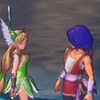
I must say, there's been a heck of a lot less lag today at reset! I like to start the day by clicking my fields to get my 1,000 Point Click Bonus before moving on to parties, and I had so much lag since last week when the updated for the new Egg Timer came out. Now...I had it lag free!
Screenshot taken from Trials of Mana using my own Switch.

I tried a bit of party clicking on mobile, to see how it was, and it's better then it was before for me. Except for the snap to top.
When I do any kind of clicking on my phone, I scroll the page down so that I can see how many notifications I have, as well as to keep parties more in the top and middle of my phone screen for the times I do party click. The snap to top makes that impossible, and results in me constantly scrolling down so it's in a more comfortable spot for me.
It really should've been kept as a toggle. And if the toggle really had to be gotten rid of, then the snap to top should've been removed entirely.
I also have the issue with clicking the pokemon name or egg link by accident, just because it extends the entire box. So I greatly thank Hayashi Rin for the CSS fix, though I do hope Niet will do a permanent fix, as it just seems a little silly for the link to extend the entire box.
Avatar by cloudtail.
My shop I do gem hunts, box hunts, dexing, have items and even breeding pairs.
PFQ B-day thread.
I just tried mass-clicking on mobile with css, and wow is it horrible now. The automatic snap means I have to scroll to get to where the button is, and the button itself is nearly off my phone's screen because of the new layout and how that affected button placement.


Yeah, I do agree that the snap-to-position thing should have stayed as a toggle. I know it interfering with CSS isn't much of a valid complaint, since CSS codes are user-made and thus any errors in them need to be fixed by the users and not the admin (so unfortunately unless the QoL code gets an update I'm tough out of luck with that bugging out on me)...
But, on mobile I don't have the CSS and the snap-to-position still gets pretty inconvenient. I also prefer to have the screen scrolled down more so I can keep an eye on my notifications, but with the snap-to-position thing, I can't do that anymore. It just scrolls right back up too high for the thin-header-bar-thing to show, yet too low for the absol icon to show.
A bit inconvenient if the reason you're clicking is to hatch eggs, since you can't see when your eggs are hatched quite as easily.
Image is from the 2020 advent calendar
They/them (preferred) or he/him pronouns.
Cannot post: Please log in to post