
Sprite Discovery Discussion
Forum Index > PokéFarm > Discussion >


you didnt come across that way, no worries.
and i understand they announce they are 'going to change those colors'
as stated i look out for that. i just dont post here often, if at all before now.
its just, What else am i supposed to do ya know?
what else are any of us supposed to do? post here i guess.
in my honest opinion, updating the sprites is fine. i just dont see the reason for overhauling the colors, even if they are announcing it. i Never Have.
its great they tell us now... i just dont see the reason for it.
the reason of 'bringing them more in line with other sprites' is... eh? scetchy at best. thats more of a reason for changing the Melan. sure. but... dont need to change the melan if you dont change the others... soooo
OR. you can change the albino, and just NOT change the melan. i dont think people would really honestly mind if they strayed from 'color theory' or whatever.
that was my reason for the Rowlet example. no changes were made to the Shiny except for the shape. so why change the colors, unless they just Wanted to? None!
but yeah. no worries abingy. you've caused no offense.
Type Race Points: 0 Check out my shop Here!
Shinies/Albinos/and random stuff!~
Summons Collecting!
0 Check out my shop Here!
Shinies/Albinos/and random stuff!~
Summons Collecting!
 6,
6, 31,
31, 14,
14, 13,
13, 8,
8, 11,
11, 10,
10, 11
11


 Clan Banner! Type Race , Dec 2020, score of: 4920
(formerly e/v and canon swap) Type Race , June 2022, score of: 5060
Clan Banner! Type Race , Dec 2020, score of: 4920
(formerly e/v and canon swap) Type Race , June 2022, score of: 5060
0 Check out my shop Here!
Shinies/Albinos/and random stuff!~
Summons Collecting!
6,31,14,13,8,11,10,11
Clan Banner! Type Race , Dec 2020, score of: 4920
(formerly e/v and canon swap) Type Race , June 2022, score of: 5060

QUOTE originally posted by Niet
You should be able to really tell just how flat the original sprites are - the reason they're so flat is because in Gen V, the sprites were actually animated and so having the sprites be shaded wouldn't look good at all. Flat colours worked well with the animation, but we don't have animated sprites here so they just look... flat.
QUOTE originally posted by Corviknight
As an aside, I feel the need to point out how silly it is that the fire is shaded on Hisuian Typhlosion. The rest of the sprite is fine but it's so stylistically strange when compared to Typhlosion or other Pokemon with fire.


Shop: SLE, egg passes, summons, & legendary seals - cheaper than site!


 MAX
MAX
Blue Soul Dew
Summon Item
( : 0)
: 0)
A small orb with a blue coloration that manages to emanate seriousness. There is talk that inside it is the key to discovering the Legendary Pokémon, Latios.
Unsellable


Aspear Berry


Aspear Berry (SOUR)
Cheri BerryCheri Berry (SPICY)
Chesto BerryChesto Berry (DRY)
Pecha BerryPecha Berry (SWEET)
Rawst BerryRawst Berry (BITTER)
Likes:
Bitter food
MAXCalm nature

quote
QUOTE originally posted by Corviknight
If I were to post every single Albino/Melan sprite with a green and purple coloration, it would be so, so many. I actually might do this later but I already know this will take a couple hours and I have obligations. (And I personally have a strong distaste for almost every single one of them.)
As an aside, I feel the need to point out how silly it is that the fire is shaded on Hisuian Typhlosion. The rest of the sprite is fine but it's so stylistically strange when compared to Typhlosion or other Pokemon with fire.
image heavy


While I have not made the Hisuian Typhlosion sprite, I can confirm that the way the flames are shaded is intentional. In fact, the fire is canonically like that (they are ghost flames to be exact) and here's the official artwork and a gameplay screenshot to show it:

 That being said, the concerns of the fire looking silly are valid - I'll be honest, I also think that it looks kind of odd, though that's mostly because I'm used to seeing normal flames, red with a fiery orange/yellow center and all. But this is what Game Freak chose to do, and we have no control over their design choices.
I hope this clears up the confusion!
That being said, the concerns of the fire looking silly are valid - I'll be honest, I also think that it looks kind of odd, though that's mostly because I'm used to seeing normal flames, red with a fiery orange/yellow center and all. But this is what Game Freak chose to do, and we have no control over their design choices.
I hope this clears up the confusion!Signature is to be refactored
Avatar: Made by Res0nare
Quote
QUOTE originally posted by Eggy
While I have not made the Hisuian Typhlosion sprite, I can confirm that the way the flames are shaded is intentional. In fact, the fire is canonically like that (they are ghost flames to be exact) and here's the official artwork and a gameplay screenshot to show it:
That being said, the concerns of the fire looking silly are valid - I'll be honest, I also think that it looks kind of odd, though that's mostly because I'm used to seeing normal flames, red with a fiery orange/yellow center and all. But this is what Game Freak chose to do, and we have no control over their design choices.
I hope this clears up the confusion!
That being said, the concerns of the fire looking silly are valid - I'll be honest, I also think that it looks kind of odd, though that's mostly because I'm used to seeing normal flames, red with a fiery orange/yellow center and all. But this is what Game Freak chose to do, and we have no control over their design choices.
I hope this clears up the confusion!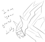


Showing the gameplay screenshot doesn't really contribute to any points in the post. Just looks like a lot of emission.
But I do agree that pixels/drawings/3d models fall under different set of rules. You don't see 3d models following the shading style of a drawing's pixel by pixel.


Typhlosion, and most pokemon who have fire on them have their fire designed to look like fire.. as you can see by the images here of Johtoan Typhlosion, it looks like fire and when it's translated to a sprite it still looks like fire.


 on the flipside, hisui typhlosion's fire is designed specifically to look like that and not to look like fire, so when it is translated to a sprite it still looks like that.
whether something is a model, a 2d image or a sprite is not the issue here, the issue is that nintendo designed the fire to look like that and so we made it look like that. We can't make it look like fire without changing what makes hisuian typhlosion what it is.
on the flipside, hisui typhlosion's fire is designed specifically to look like that and not to look like fire, so when it is translated to a sprite it still looks like that.
whether something is a model, a 2d image or a sprite is not the issue here, the issue is that nintendo designed the fire to look like that and so we made it look like that. We can't make it look like fire without changing what makes hisuian typhlosion what it is.
QUOTE originally posted by Shazi
Typhlosion, and most pokemon who have fire on them have their fire designed to look like fire.. as you can see by the images here of Johtoan Typhlosion, it looks like fire and when it's translated to a sprite it still looks like fire.
on the flipside, hisui typhlosion's fire is designed specifically to look like that and not to look like fire, so when it is translated to a sprite it still looks like that.
whether something is a model, a 2d image or a sprite is not the issue here, the issue is that nintendo designed the fire to look like that and so we made it look like that. We can't make it look like fire without changing what makes hisuian typhlosion what it is.
we're looking into redoing the fire to see if we can make the shading less intense now, hopefully we can come up with something that better suits what the userbase is looking for from this sprite
Edit: I meant to say "I see what you are saying about the shading looking janky" but I'm a dingus and forgot to put that up front of my post

saintcrows
QUOTE originally posted by saintcrowns
I'm sorry... can someone on the art team please explain to me what is going on with the left (our left) most wing on Dartrix? I would love to be wrong but looking at it my first impression is that the wing is either broken or way way lower than it should be...

as shown here

Spewpa
QUOTE originally posted by Spewpa
i really like the new hisuian sprites + sprite revamps! they now look a lot more dynamic if you know what i mean.
while i am a bit sad about the changes in melan alolan decidueye's line, the colors on its melan hisuian form work really well in my opinion.
however, i think dartrix's left wing looks off? it looks as if it's bent really weirdly while waving(?). its official art appears to be waving as well, but it appears more natural in that case. perhaps if the left wing was held straight like the official art it would look more natural?
i apologize if i'm being presumptuous towards the art staff!
something like this?
please let me know if drawing the sprite isn't allowed and violates the sprite permission rules.
 sprite created by pfq art staff, redrawn by me but the left wing is slightly different
sprite created by pfq art staff, redrawn by me but the left wing is slightly different
 credits
 Novan-Chan and all forms of her belong to me
Avatar of Novan is made by me for my use only!
Cannot post: Please log in to post