
Sprite Discovery Discussion
Forum Index > PokéFarm > Discussion >
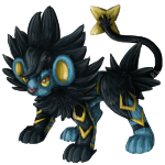


I personally like the shiny feral; but I just like the colors and think it looks good. But it is jarring from the normal shiny.
The albino and melan color change I'm kinda iffy on. The melan looks like a darkened version of the albino... which it might supposed to be? But I'm overall, not impressed with the grey.

Background done by Golden Tempest. Sprites are official. This banner is for Lady Elemental's use.

Made by BlackBlood1872, more banners here
Avatar made by BananaLizard

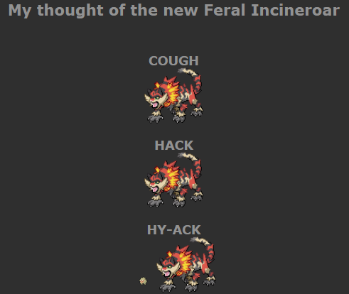
Now that I think of it. one of the thing that would "save" feral incineroar is to switch the orange and the black. The main gimmick of Litten line is that they are black stripped orange rather than orange stripped black like a tiger. Being more like a tiger just make them out of the place. More like another fakemon rather than an alternate evolution.
My first language is french! So sorry in advance for misunderstanding xD
Profile picture made by myself!
Gacha for DCP!


Considering its a regional evolution in the same vein as Alolan Marowak, Raichu etc it doesnt exactly have to "flow" with the rest of the line.

 100/∞ ||

That's a good point. I think that explains the colour changes and all. But it just doesn't seem to gel well. You can still tell what marowak and raichu and the new galar mons are forms of though, and this feels... A bit further out than those.


I like the shiny feral a whole lot too, but agree that I don't think it sits right with the rest of the line when the normal follows the same colour scheme as regular incineroar?
There are other pokemon that drastically change though - looking at the likes of Gengar and Charizard (especially X and Y forms) - so make of that what you will.
I think the art team might have decided to go with the blue to draw on the "electric" typing it now has. The design itself with the normal colours doesn't really give me electric vibes otherwise - it looks like it should just be straight fire?
EDIT: I've just seen the artwork and the 'electric' vibes in the design stand out a lot better there. The fur as is on the current sprite gives too many typhlosion vibes instead of looking kind of 'stuck up with static' like the art does. As well, in sprite you can't see the markings as good...and the fur zig-zag leggies aren't as pronounced. Appreciate there's only so much you can do in such a small space though!

Edited by Chronos

Edited by Me

Edited by Me
Edited by Me
Credits; Icon (see below), SignatureTCG Artwork
Icon is from the official Love Live School Idol Festival Mobile App <3


I think the new albino Litten looks really bad, that color is just not right. However, I am in love with all the colors of the feral line; the albino looks like a kind of Galaxy purple, the shiny is a gorgeous blue, and the melan just looks cool. I guess I'll have to hunt these at some point now, lol. I don't mind looking at the feral variant, it's neat.
As for the updated poses, Incineroar and Torracat look more sharper, more defined, which I like. However, I do prefer the original Litten pose over this new one.


I don't like the new sprite, mostly from the detail and the thick hand-paw creations, but also with how it looks overall. But i do like the color palette, it just.. a lot of tiger, less pokemon-ish. 👍
I mean, seeing it in its 'feral' glory, i only had one thought, and 'as it should be' in these trying times.
 📓
feat. Arasprit, and the link to the post in my journal, considering it's a screenshot.
📓
feat. Arasprit, and the link to the post in my journal, considering it's a screenshot.
📓
feat. Arasprit, and the link to the post in my journal, considering it's a screenshot.- ✨
- ✨
You know what is great? Knowing somewhere out there, someone is salty that you are still fighting along in this rulebreaking game of Life.
 I do Shiny Charm Swaps for 25 GP
 each! just send a labeled trade!
I do Shiny Charm Swaps for 25 GP each! just send a labeled trade!
Any Equivalent, even 25,000 credits or 5 zc
WIP 2ND TAB!
Credits


really not a fan of the new sprite. the concept art looks great, but it just...didn't translate well imo. i assume it's supposed to look like it's roaring since "feral", but the face just looks...blank? like there's no actual emotion or anger
and the feet are...very awkward looking. the one on the left is bigger than the rest, when it should seemingly be smaller since it's farther away? i guess it's more splayed out or something but....idk. the whole thing just looks really awkward to me. it's a shame because i love the concept art. i get it's probably hard to pack information into a 100x100 sprite but....just wish it had more emotion and didn't look so static


i really dislike the changes made toe torracat and incineroar's default sprites.
i really dislike the changes to the albino and melan.
the feral sprite looks... really busy, the concept art for it is really great! i like it. but there's just a lot going on, the paws also looks awkward. it's a weird mix of feral paws + hands that doesn't really work and the perspective looks off to me. otherwise though a feral incineroar is a really neat concept!


Oh my god? I love it? Oh my god give me a million of these, please. I’m actually going to flat out try to melan hunt Litten again when I’ve got the motivation.
hippity hoppity your Litten eggs are now my property
Come explore the Colescia region!
Cannot post: Please log in to post