
Sprite Discovery Discussion
Forum Index > PokéFarm > Discussion >


at first i was devestated at the new snowshrew melans, i even got teary becasue i literally hunted them for the grape color to name them after grape sodas, now i have to come up with different names....
but the news ones are okay, i guess. everythings gunna change, better get used to it!


 |
| | Buying:
 |
|  |
| 


We tried really hard to keep the purpley sprites. :/ Unfortunately it meant that the kanto ones would have looked.. well funky. I couldn't find a nice inbetween, and believe me, I tried. I tried to keep the normal's current melan colors, but that made the alolan line end up weirdly colored. :/ I know the change is kinda drastic, but I really, really did try!
I kept ending up with an off looking swampy yellow green for the melan kanto slash's quills. Why did Nintendo have to make them RED. >/ Anyway, hopefully you guys will adjust rather quickly, and no one wants to chew on my ears for the change. ^^
I do like that the new melan kanto has the green quills though >3 they remind me of jade or emerald or prasiolite, which is the quartz crystal that melan pixrine is based off of. :D
avatar art by Novan-Chan.


I'm loving the new melan snowshrews; we never get that nice burgundy color for melans, honestly it's one of the better ones. Purple is my favorite color, but this red is so snazzy I love it so so much.
I even like the new albinos for both lines; the mint works so well and the soft pink on the snowshrews is exactly what an albino should be.
I will say, I will be super heartbroken if sandslash's melan is updated to match the new totem one... That green and that dark blue go so very badly together, imo. If either were different (actually black w/ green, or midnight blue with literally any other color) it would be great. It's not even a problem with the melan being green, it's specifically that the combination looks really bad.
I read Bananalizard's post after I wrote this and it looks like they will match... But I don't understand why. I don't know why it has to be this way, or why the Alolan Snowshrew's color has literally anything to do with it. They should be treated completely separately??
Just... The midnight blue + broccoli green is the issue. Not either color, but them together.
 × 0 / 1000
The sprite doesn't look too bad on my screen, although the blue appears pretty grey to me so maybe that's why.
Otherwise, we don't really know what rules the art staff has for melans and albinos, just that they're updating them to meet those rules. It's one of those things I'd just rather not question.
⚢
Sylveon PFP from Pokemon Shuffle

Honestly, the sacrifice was worth it. Getting an underrated color because of the kanto melan is fine in my book! So many melans have those nice purple colors, but we need a little more red in our lives!
i have nothing but love for
the places that call me home

★ art made by me
★ background
★ icon - me
-
my shop
I’m upset as per usual- idk I just dont like the purples and greens.
Makes all of the melans look like the Hulk to some degree xD
The new Kantoslash has got broccoli hair and every time Alolaslash changes it makes me want the original one back more ;-;
 Rip perfect melan kid :c
Ik the art team is working hard to make the melans look good, but the new consistency is just not my cup of tea and has turned me off from melans almost entirely e-e;
I wasn’t here for the Kanto/Johto revamps but I was for the Hoenn and after finding a bunch of the old Kanto/Johto sprites I’ve just gotten more upset because the majority of the old melans were actual perfection and I don’t see why the revamps are needed for most of them.
Rip perfect melan kid :c
Ik the art team is working hard to make the melans look good, but the new consistency is just not my cup of tea and has turned me off from melans almost entirely e-e;
I wasn’t here for the Kanto/Johto revamps but I was for the Hoenn and after finding a bunch of the old Kanto/Johto sprites I’ve just gotten more upset because the majority of the old melans were actual perfection and I don’t see why the revamps are needed for most of them.
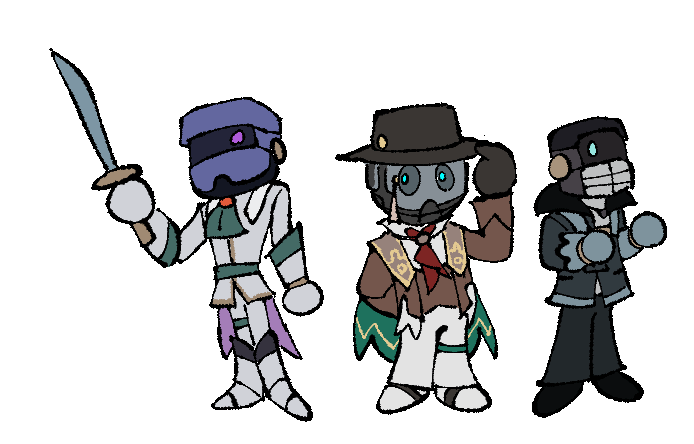
owo i personally adore the new melan alolan sandslash. It looks like it's got emerald quills and I'm loving it
Avatar drawn by https://pokefarm.com/user/Breadkureiji
 Check out our trade shop
Check out our trade shop

Henlo! ima bout to tell yall about colour palettes and why the newest melan alolan Sandslash is objectively better than it's past 2 incarnations
 So as you can see from the colour gamut there is a V shape, this isnt bad (trust me, it could look like barf) but it is not ideal, usually colour palettes want to be triadic or complementary or analogous. all are good. this palette is none of those.
 This one is a nicer palette than the first one and is not a V, more triadic, much good. also considering the goal of making it simialr to shiny contrast wise, it does that well~
Love u art team <3
This one is a nicer palette than the first one and is not a V, more triadic, much good. also considering the goal of making it simialr to shiny contrast wise, it does that well~
Love u art team <3
The first one
the newest sandslash owo
credit
Background drawn by AdimivA on twitter
Gif created by JUSTICEBEETLE
F2U & Icon code by Gumshoe


The 2nd one is the current one tho. I think the last one is the original one? cuz it aint on the wiki. Anyways, the melan alolaslash cant have much contrast anyways, because the shiny has hardly any contrast either

 100/∞ ||
 QUOTE originally posted by Psychøkin
The 2nd one is the current one tho. I think the last one is the original one? cuz it aint on the wiki. Anyways, the melan alolaslash cant have much contrast anyways, because the shiny has hardly any contrast either
Cannot post: Please log in to post