
Sprite Discovery Discussion
Forum Index > PokéFarm > Discussion >


Type varients would be awesome. However, that's kind of what deltas are. It would be weird to have, say, a fire-delta Bulbasaur and then see a genuine fire-type Bulbasaur
⚢
Sylveon PFP from Pokemon Shuffle


I still would just prefer variants and not fusions, personally. Or if it has to be a fusion then not like.. I’m not sure the word but again, Ryukuza has Rayquaza’s body for the sprite, I dislike that it wasn’t an original sprite with a new and original spirited body instead


QUOTE originally posted by pixelkitty
Type varients would be awesome. However, that's kind of what deltas are. It would be weird to have, say, a fire-delta Bulbasaur and then see a genuine fire-type Bulbasaur
avatar is my own art!
formerly known as chimeranyx
I currently have shiny and albino Elgyem UFT. Check my fields for prices!


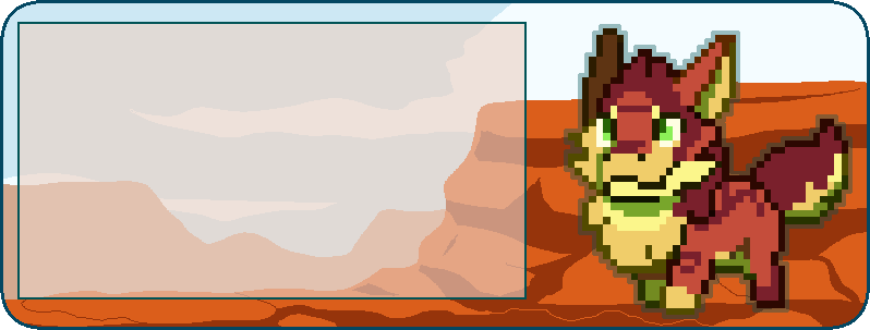
I didnt love or hate ryukuza at first, but its grown on me over time, even if I agree the legs are a bit off. I like the goggles lol. I'll have to get a shiny sometime, the colors for it are really nice.


 Paused Raikou hunt: 360h/4s/4a/0m


Ryukuza is INFINITELY better than its PF1 sprite if you ask me. When I played PF1 so long ago I couldn't even tell it was a Rayquaza/Flygon fusion, and just thought it was a weird Rayquaza custom sprite. This sprite makes that conceptmore clear and honestly makes it look cool!

Source: Eastern Mind (MS-DOS), the Chu-Teng Symbol
~CWS - THE EPIC BLUNDER~
QUOTE originally posted by Camwoodstock
Ryukuza is INFINITELY better than its PF1 sprite if you ask me. When I played PF1 so long ago I couldn't even tell it was a Rayquaza/Flygon fusion, and just thought it was a weird Rayquaza custom sprite. This sprite makes that conceptmore clear and honestly makes it look cool!


Yeah, a mod or artist said the whole thinking behind it was “I want to do an event with a rayquaza thing and I think it looks cool if I slap some wings on here and change the horns a little”
On pf1
There’s definitely more thought out into it this time

Signature by CatEnergetic, with help from Wardove. Art by Miasaurus.

Alright, I think its high time I said something.
Now dont get me wrong, This is in no way meant to be "rude" or "mean" towards staff but I do have some things I need to point out about this sprite that, bothers me a bit.
 Problem 1: the top of the body seems like it is twisted to far to one side and it just seems uncomfortable.
How to fix: twist it back the other way just a little bit, or twist the lower part of the body to match the curve the top half is portraying.
Problem 2: The wings seem off to me, from the concept that was posted the wing that is closest to us seems a bit to low, the body part it is attached to doesn't seem curved. so why is the wing slanted like it is?
How to fix: Simply raise the wing up some so it matches the one in the back with its hieght.
Problem 3: The feet are too stiff.
How to fix: the one on this side could maybe be turned out just a bit I think this would fix a bit of that stiffness
Problem 1: the top of the body seems like it is twisted to far to one side and it just seems uncomfortable.
How to fix: twist it back the other way just a little bit, or twist the lower part of the body to match the curve the top half is portraying.
Problem 2: The wings seem off to me, from the concept that was posted the wing that is closest to us seems a bit to low, the body part it is attached to doesn't seem curved. so why is the wing slanted like it is?
How to fix: Simply raise the wing up some so it matches the one in the back with its hieght.
Problem 3: The feet are too stiff.
How to fix: the one on this side could maybe be turned out just a bit I think this would fix a bit of that stiffness
 Problem 4: this one here goes for the two above. The markings are rather difficult to see, More so on the albino than it is on the normal sprite. at a first glace you can see the markings on the normal sprite, but upon first glace of the albino, it looked like a pastel purple noodle to me and I had to strain to see the markings.
How to fix: Maybe darken the green or the yellow on the normal sprite, and as for the albino, maybe pick something with a bit more contrast, something that stands apart on the purple color like that green does.
I should add that I do not hate this sprite, in fact it is indeed a neat fusion, but things about it just throw me off. I Absolutely love the colors on the shiny. would just be better if we could see the markings on the other varaints N/A the same way.
I know a bunch of people have said things about constructive critisism, and im hoping this falls under the realm of that. Ive given the issues and a possible solution to each one.
Problem 4: this one here goes for the two above. The markings are rather difficult to see, More so on the albino than it is on the normal sprite. at a first glace you can see the markings on the normal sprite, but upon first glace of the albino, it looked like a pastel purple noodle to me and I had to strain to see the markings.
How to fix: Maybe darken the green or the yellow on the normal sprite, and as for the albino, maybe pick something with a bit more contrast, something that stands apart on the purple color like that green does.
I should add that I do not hate this sprite, in fact it is indeed a neat fusion, but things about it just throw me off. I Absolutely love the colors on the shiny. would just be better if we could see the markings on the other varaints N/A the same way.
I know a bunch of people have said things about constructive critisism, and im hoping this falls under the realm of that. Ive given the issues and a possible solution to each one.
Check out my Shops
Avatar was made by StinkyBinky here on PFQ


The ryukaza is cute! I just now caught a glimpse of one in someone’s party. :3
Art credit to Axelbby
Stormlion/ Trans-Male/ 24/USA
A Mewlotic who sometimes appears in the forms of other Pokémon


Congrats Quiint! I love the melan colors c:

gif by Gaëlsøn!


I collect Bug Deltas!
Profile Pic & About Me drawn by me!Cannot post: Please log in to post