
Sprite Discovery Discussion
Forum Index > PokéFarm > Discussion >


QUOTE originally posted by Esme
Okay
I hate this thread with a passion, but I have legitimate complaints.
The mega itself has a very nice design, but I'm sorry, the sprite is very awkwardly done.The head seems too small, the face looks very wonky, and the leg anatomy seems... off. It doesn't look sleek like how the original looked.
Also, green for the melan? No. Nononono. That does not fit Liepard, and I don't know how you go from the nice dark red on the shiny to... GREEN. The black and white scheme was a lot better, especially since it actually made Liepard look like a black cat, and I'm sure people would prefer a black cat Pokemon. Perhaps dark blue or purply blue would fit a lot better (you, the shade that melan Pyroar has) would work a lot better.
Profile picture by me!
Animation Commissions OPEN! (15+)
My batty babies:


 Bat drawings by TheSoapyDolphin
Bat drawings by TheSoapyDolphin


ok maybe green isnt the best fitting color for a cat, but i'm biased cuz i do really like the color green in general... lol

 100/∞ ||


Like... what I don't understand is that when things like this come up, the art staff talks about having a set standard for their changes.
Wouldn't that make the melan red/orange, with purple-y accents, since they've said before it's based on the shiny?
And the albino would be purple, yellow... plum/baby pink and cream. Because it's supposed to be based on the normal Pokemon.
These changes seem to defy their own formula and I don't understand.
(Not complaining on the melan tho - at least the base is black-black and not green black, I actually like the green as an accent. I just think the green albinos are getting ridiculous and it fits SO poorly with liepard.)
 × 0 / 1000
Just because it's complementary, it doesn't always make it good. Blue is more of a complementary, which is why I think it would look better.
i have nothing but love for
the places that call me home

★ art made by me
★ background
★ icon - me
-
my shop


QUOTE originally posted by Esme
Okay
I hate this thread with a passion, but I have legitimate complaints.
The mega itself has a very nice design, but I'm sorry, the sprite is very awkwardly done.The head seems too small, the face looks very wonky, and the leg anatomy seems... off. It doesn't look sleek like how the original looked.
Also, green for the melan? No. Nononono. That does not fit Liepard, and I don't know how you go from the nice dark red on the shiny to... GREEN. The black and white scheme was a lot better, especially since it actually made Liepard look like a black cat, and I'm sure people would prefer a black cat Pokemon. Perhaps dark blue or purply blue would fit a lot better (you, the shade that melan Pyroar has) would work a lot better.
@Anduin
Tell that to Espeon, Jynx, Cyndaquil, Umbreon, Litleo, Articuno... please stop the whole "OMG EVERY MELAN IS GREEN" thing, because it's making complaints like mine look bad.


QUOTE
Wouldn't that make the melan red/orange, with purple-y accents, since they've said before it's based on the shiny?
Passively collecting ;
♦ Buying:  's at 20zc/100gp/100k per - send a labeled trade!
♥ Passive Summons:
's at 20zc/100gp/100k per - send a labeled trade!
♥ Passive Summons: 


 ♦ Delta points for Milcery / Kitwurm
Avatar from PFQ Advent ♥
♦ Delta points for Milcery / Kitwurm
Avatar from PFQ Advent ♥
's at 20zc/100gp/100k per - send a labeled trade!
♥ Passive Summons:
♦ Delta points for Milcery / Kitwurm
Avatar from PFQ Advent ♥ Score: 10764
QUOTE originally posted by brindlefinch
Like... what I don't understand is that when things like this come up, the art staff talks about having a set standard for their changes.
Wouldn't that make the melan red/orange, with purple-y accents, since they've said before it's based on the shiny?
And the albino would be purple, yellow... plum/baby pink and cream. Because it's supposed to be based on the normal Pokemon.
These changes seem to defy their own formula and I don't understand.
(Not complaining on the melan tho - at least the base is black-black and not green black, I actually like the green as an accent. I just think the green albinos are getting ridiculous and it fits SO poorly with liepard.)
They create the color schemes for the albino/melanistic based off of the normal/shiny colors.
Normal -> Albino
Shiny -> Melanistic
As for the melans being certain colors because the shinies have certain colors, I don't... think that's correct? Could be wrong, probably am, and I do not have a different way they do them, but that just doesn't sound that.... correct to me.

I just don't understand why post revamp dark green seems to show its face so often in melans. I fully accept getting rid of the technicolor though I'm sad to see it go but like.... that green is everywhere and I am not a fan. Pidgeot and Kommo-o are the worst offenders imo but there are more like Venomoth Dewgong even Voltorb and Electrode have a weird greenish tinge and that's just me looking at the Kanto mon for five seconds, I could find more.

sigh. we're gonna really get into it this time about the green, aren't we? if a melan is any color other than blue or purple it's time to riot. this statement is not referring to those who dislike the green and want to voice that reasonably.
here's the art of it, for those who didn't check the original thread, and also the sprites for easy reference:
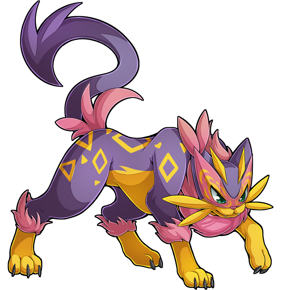


 anyways. anyone who knows me very well can probably guess my stance on this sprite. i don't really like liepard much so that extends to this mega, and i feel like the main new addition here was just some neck fluff. the swirly mask is actually pretty cool, but it doesn't translate to a sprite very well, i think.
additionally, the art is very dynamic here, but i feel like the sprite does not quite convey that as well as the art does. the sprite is just looking up a little bit, paw extended, and looks more sassy than anything.
i don't enjoy the coloration of the albino and melan very much, either. it's very hard to distinguish any details on the albino's face here, and while i actually think non-mega melan liepard will look great, that green fluff does not accent the dark blue/brown base of it. i think that in this scenario another blue on the fluff would work better.
anyways. anyone who knows me very well can probably guess my stance on this sprite. i don't really like liepard much so that extends to this mega, and i feel like the main new addition here was just some neck fluff. the swirly mask is actually pretty cool, but it doesn't translate to a sprite very well, i think.
additionally, the art is very dynamic here, but i feel like the sprite does not quite convey that as well as the art does. the sprite is just looking up a little bit, paw extended, and looks more sassy than anything.
i don't enjoy the coloration of the albino and melan very much, either. it's very hard to distinguish any details on the albino's face here, and while i actually think non-mega melan liepard will look great, that green fluff does not accent the dark blue/brown base of it. i think that in this scenario another blue on the fluff would work better.

official project sekai art; icon is official TCG art
he/him + 22 + cstCannot post: Please log in to post