
Sprite Discovery Discussion
Forum Index > PokéFarm > Discussion >


QUOTE originally posted by Rokon
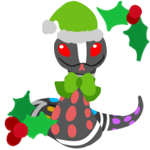
...Now, on a different note, I have a different sprite gripe. Aytheraye.
 It's only being mentioned due to the fact that the sprite still looks like it's making an obscene gesture and I've been meaning to make a post on it and I keep forgetting and yes I know the aye-aye but that doesn't detract from the fact that this Pokemon is giving me a cheeky, monstrous grin and holding its hand like that.
It's only being mentioned due to the fact that the sprite still looks like it's making an obscene gesture and I've been meaning to make a post on it and I keep forgetting and yes I know the aye-aye but that doesn't detract from the fact that this Pokemon is giving me a cheeky, monstrous grin and holding its hand like that.


QUOTE originally posted by Anom
QUOTE originally posted by Rokon
...Now, on a different note, I have a different sprite gripe. Aytheraye.
It's only being mentioned due to the fact that the sprite still looks like it's making an obscene gesture and I've been meaning to make a post on it and I keep forgetting and yes I know the aye-aye but that doesn't detract from the fact that this Pokemon is giving me a cheeky, monstrous grin and holding its hand like that.
It's only being mentioned due to the fact that the sprite still looks like it's making an obscene gesture and I've been meaning to make a post on it and I keep forgetting and yes I know the aye-aye but that doesn't detract from the fact that this Pokemon is giving me a cheeky, monstrous grin and holding its hand like that.


I read a bit of the posts here and I guess I want to share my thoughts about it as well.
When it comes to the Albino/Leucistic, I like the updated versions cause I love consistency. I am happy that the staff found/set their certain rules when it comes to coloring these in, cause it makes it look as a whole set and not just a collection of "what looks good/cool".
I agree that some took some getting used too and that some previous colors where nice to the eye and I wouldnt mind having to keep. But my ocd mini me would scream that it just wouldnt feel right as a whole set. I myself am busily working in a shiny and albino live dex so I don't hunt which ones I like I just hunt them all. So that might be the reason why I am okay with some of my personally liked "old" albino's going. And if there is a certain sprite you don't like I am sure that with some coding that is fixable?
For the sprite work when it comes to shading.. I am currently learning how to sprite so please take my words with a grain of salt. But the shading in my eyes looks correct? The official sprites seem to follow a certain set of logic and guidelines when it comes to shading, from what I can tell the art staff follows those guidelines. The biggest part I am struggeling with when it comes to sprites is shading.Each time when I think I get how the shading of these sprites work another official sprite pops up that I take a closer look at that doesnt follow that set of rules. Maybe it was just easier to animate those that way but from what I learned so far is that you have to try and compare the closest thing. A snake like body is differently shaded then something with wings etc.
When it comes to reading the designs. I myself draw a lot, I design a lot of things and I have learned one thing about readability.. it is one big pain in the behind. Because everyone looks at something differently. The creator has a certain design in their head so to them it goes immidiatly to that certain aspect of the design. To someone who knows the concept they will see it as well. Tho persons who see the design for the first time and don't know the concept, its 50/50 from my personal experience. You have a few people who see what you see or something similar and then there are a few who see something completely different or fail to make anything readable from it at all. I haven't found a fix for that yet cause everybody has different personal experience with what they see. The brain is weird like that they always tend to link things with the knowledge that it already has. If your brain links pale green colors with being sick then I agree with you that a lot of them look "sickly" pale but if your brain doesn't link that color with that certain feeling then they turn from a sickly pale to just pale.
to explain my thought some more lets go with the sprites that where posted by rokon. Now I understand their logic behind it and they do a good job explaining what is conflicting for them. So I thought it would be good to pick those sprites to show how 2 different people can read the same sprites. Now with me drawing a lot and me working with animals, I studied to become a animal carer and currently work as a volunteer at a exotic animal shelter that specialised themselves in reptiles.
Thus for me shadows and certain movements tend to be easier or differently readable then to others. and anatomy and color choises when it comes to animals make faster sense to me.
I dont really see what is wrong shading wise with Faemísimo so I will skip that one before I say a dumb thing XD
When it comes to Goldesem I can immidiatly tell it is flying/floating because of the way the feathers/ribbons? move in a certain way. If it wasn't in the air its tail would be facing the other way because the base of the feather starts at goldesem's behind and would have to awkwardly bend to even snap if it was standing on the ground. The rest of the feathers would mostly lay flat against the body, not up in the air.
I can completely understand why someone would see it as if its not floating but because I drew floating ribbons before my mind recollects that memeory and makes me read the sprite this way.
Desert Phasmaleef is based of a stick bug I believe at least in my head and those tend to be just one color. Its their whole act, they blend in pretending to be a stick. Phasmaleefs pokedex entry is all about how it uses its environment as protection from predators. Having a lot of contrast would work against this pokemon a lot. So I can see the choice behind it being so evenly collored. Is it something nintendo/pokemon would do as quickly? perhaps not but to me it makes a lot of sense for it to not have a lot of contrast.
As for minibitt I kinda agree and dissagree. Yes it looks differently then what pokemon would normally do when it comes to the metalic mons we already have. But I also have to keep in mind that a lot of the pokemon mentions as examples have a very squarish body shape, while minibitt is round. So shading already is differently right from the get go and is just not something we are used to seeing cause the only thing we have to really compare it to are things like magnezone and aggron and those still have way different body types as minibitt even if they are rounder. The artist in me thinks the shading on minibitt especially the highlights really make it metal in appearance, and drags me back to my childhood where I had a lil robot bunny to play with. While the pokemon nerd in me would probably question if it would fit in with the current official steel types.
Kalahowli is based of a african wild dog I believe, and they have really buisy patterns so I completely understand that at first glance it is hard to see what is pattern and what is shading but if you look at it a bit closer and longer thigns at least for me start to make sense? But that is probably due to my previous knowdlegde that my brain is linking when seeing the sprite.
I have cared for roosters in the past and I always remember their beautifull shiny tail feathers, so to me the highlights on Toxitrice look normal. To me they would look weird witouth.
To me there is nothing wrong with Aytheraye, because in my eyes its based on the aye-aye and I know that they have a longer finger to try and find food with. I know the placement of that finger so my mind immidiatly goes to that instead of a obscene gesture.
Lastly to go with the mega's and pfq going for the more is better stuff... have you looked at the official mega evolutions? They are all about more wings, more spikes, more flowers, more ribbons, more hair etc. I think that the reason they look more buisy is because these are small 2d sprites instead of bigger 3d. But I think that if with some of the designs they would go less it would look more then a re-design isntead of a mega evolution.
Okay so that was my intake on it all, this by no means is me attacking other people or something alike. I know that everyone here has different oppinions and I get most of the stuff that is being typed. but I also have a feeling that somethimes people forget to accept other oppinions as well.. you know the .. agree to disagree thing? But it could also be me reading things in a more negative way then they where intended. So -shrugs- I am human and I can't read minds so I only can go off based from what I read

 Melan Entei Hunt
Code made by: me -- Image Credit(s)


QUOTE originally posted by DuchessLunaire
When it comes to the Albino/Leucistic, I like the updated versions cause I love consistency. I am happy that the staff found/set their certain rules when it comes to coloring these in, cause it makes it look as a whole set and not just a collection of "what looks good/cool".
QUOTE originally posted by DuchessLunaire
And if there is a certain sprite you don't like I am sure that with some coding that is fixable?
QUOTE originally posted by DuchessLunaire
I am currently learning how to sprite so please take my words with a grain of salt. But the shading in my eyes looks correct? The official sprites seem to follow a certain set of logic and guidelines when it comes to shading, from what I can tell the art staff follows those guidelines.
QUOTE originally posted by DuchessLunaire
I dont really see what is wrong shading wise with Faemísimo so I will skip that one before I say a dumb thing XD
QUOTE originally posted by DuchessLunaire
When it comes to Goldesem I can immidiatly tell it is flying/floating because of the way the feathers/ribbons?
QUOTE originally posted by DuchessLunaire
Desert Phasmaleef is based of a stick bug I believe at least in my head and those tend to be just one color. Its their whole act, they blend in pretending to be a stick. Phasmaleefs pokedex entry is all about how it uses its environment as protection from predators. Having a lot of contrast would work against this pokemon a lot.
QUOTE originally posted by DuchessLunaire
As for minibitt I kinda agree and dissagree.
QUOTE originally posted by DuchessLunaire
Kalahowli is based of a african wild dog I believe, and they have really buisy patterns so I completely understand that at first glance it is hard to see what is pattern and what is shading but if you look at it a bit closer and longer thigns at least for me start to make sense?
QUOTE originally posted by DuchessLunaire
I have cared for roosters in the past and I always remember their beautifull shiny tail feathers, so to me the highlights on Toxitrice look normal. To me they would look weird witouth.
QUOTE originally posted by DuchessLunaire
Lastly to go with the mega's and pfq going for the more is better stuff... have you looked at the official mega evolutions? They are all about more wings, more spikes, more flowers, more ribbons, more hair etc.
cee - he/she/they - 21
icon from Rachel and Jun youtube
sig sprite by me
 stoked sparksurfer!
everything i post is to be read in the flattest voice possible
stoked sparksurfer!
everything i post is to be read in the flattest voice possible
stoked sparksurfer!
everything i post is to be read in the flattest voice possible

I'm not entirely sure if this is spam, but I made a guide to show which sprites are missing from the wiki. It has all sorts of odds and ends such as wiki completion progress and a found Pokémon history (starting from Oct. 22).
Enjoy!
they/he
avatar by me
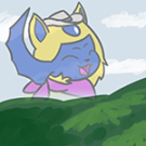
Gumairy Looks Like A Boohbah But Not Creepy.
The Shiny Doesn't Stick Out To Me Personally And I Can't Pin Point Why. But I Really Love The Albino. It's A Little Snowball~
Does It Evolve Or Is It Forever A Cute Little Fluffy Boohbah?
~Edit:
Oh My, It's A Pixie.
I Like The First Form Better Honestly.
Can't Wait To Get My Own Boohbah~

Oh my god what a good boy I need 600 of them.
 kase. male he/him. 25.
bg
kase. male he/him. 25.
bgf2u @hamha.tumblr.com
|code@is it necessary + @hercules, edits by me
pixel@gaelson, commission by @canine
|icon@gezeichnet
sig image@jurobii
characters are mineand @canine's
.


The meme child is here.
After months and months of tasking waiting.
The Meme Child is here my doods.
On an unrelated note, my bab is next tourney owo
These new fakemons are absolutely adorable! The albino looks great as well to boot, I think I’ll also be needing a good 600 of these. They make me wanna squeal and give ‘me a good ol’ hug!

credit
Background from Unsplash
F2U code by Gumshoe
Oooo the shiny is really pretty and the albino is a soft pastel bab... I love them... So much.
Cannot post: Please log in to post