
New site logo proposal
Forum Index > Core > Announcements > News Archive >
POLL: New logo: good or not?
![Niet [Adam]'s Avatar](https://pokefarm.com/upload/:J/avatar/Niet_Icon150.png)


After overwhelming support, the new logo has been implemented. Thank you for your feedback!
So a while ago we updated the site logo, mostly just to make it use the then-current site's standard colours. But it's getting a bit old, really. The letters just don't work at the small size of a browser tab, and the brown isn't part of the default colours any more. It also doesn't do much to communicate anything about the site. That's why I'm proposing a new logo:
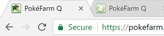
 And for comparison how it appears in browser tabs (note I have 4k monitors so it's double-size :D)
 What do you think? Vote in the poll above and leave a comment if you have some feedback to give. Note that the poll isn't binding, it's just to get general opinion and we'll take it into consideration either way before making a final decision.
So a while ago we updated the site logo, mostly just to make it use the then-current site's standard colours. But it's getting a bit old, really. The letters just don't work at the small size of a browser tab, and the brown isn't part of the default colours any more. It also doesn't do much to communicate anything about the site. That's why I'm proposing a new logo:

Clip from Pokémon anime, re-lined by me
-- OMNOMNOM!Featured story:
Injustice
Feedback welcome!


aye i love it! it is an egg hatching game after all, and the colours are nicer too ^^
 0 points
Mouse's Midnight Market! S/A/M sales, boxboxes, gem swaps, summon sales & more
Avatar art by me
0 points
Mouse's Midnight Market! S/A/M sales, boxboxes, gem swaps, summon sales & more
Avatar art by me


Being on mobile 99% of the time, I never even see the current logo. Might be worth sticking it (whichever version gets the votes) somewhere visible across all platforms.


i like the egg one
All You need Is Cheap Shinies Store
Cheap Melans For Sale
Clicking my fields yields >20k credits. They are stacked so give it a try? :)

The new one is much cleaner and easier to see!

gif by Gaëlsøn!


I collect Bug Deltas!
Profile Pic & About Me drawn by me!

i like it! an egg is very descriptive. i didnt even realise the current logo was "pfq" unowns at first it just looks like some radnom scribbles in a box.
credits


avatar edited by me, signature coded by me

that is the perfect icon for it!


 im also an artist


the new logo looks much more clearer,smoother and overall fits the game’s theme more :3
check out my art shop ~!
 credits:
-icon is official hazbin hotel art!
-background art is official art
credits:
-icon is official hazbin hotel art!
-background art is official art 3/???
3/???
credits:
-icon is official hazbin hotel art!
-background art is official artand edited by me
23/200 3/???
Cannot post: Please log in to post