Single post in New site logo proposal
Forum Index > Core > Announcements > News Archive > New site logo proposal >
![Niet [Adam]'s Avatar](https://pokefarm.com/upload/:J/avatar/Niet_Icon150.png)


After overwhelming support, the new logo has been implemented. Thank you for your feedback!
So a while ago we updated the site logo, mostly just to make it use the then-current site's standard colours. But it's getting a bit old, really. The letters just don't work at the small size of a browser tab, and the brown isn't part of the default colours any more. It also doesn't do much to communicate anything about the site. That's why I'm proposing a new logo:
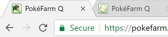
 And for comparison how it appears in browser tabs (note I have 4k monitors so it's double-size :D)
 What do you think? Vote in the poll above and leave a comment if you have some feedback to give. Note that the poll isn't binding, it's just to get general opinion and we'll take it into consideration either way before making a final decision.
So a while ago we updated the site logo, mostly just to make it use the then-current site's standard colours. But it's getting a bit old, really. The letters just don't work at the small size of a browser tab, and the brown isn't part of the default colours any more. It also doesn't do much to communicate anything about the site. That's why I'm proposing a new logo:

Clip from Pokémon anime, re-lined by me
-- OMNOMNOM!Featured story:
Injustice
Feedback welcome!