
Site Skins: How-To, and Helpful CSS
Forum Index > PokéFarm > Guides >

I've been kinda having trouble with these two things of code, any help would be great thanks!
1. You have the credits as a sprite or image and it's visible with every tab open (you can open every tab and the credits would still be there)
2. In like an About Me, you have an image, and when you hover over it it either hides the others tabs or opens to a new one? (Let me know if that made any sense at all)


 Hunting Noibat!
credit


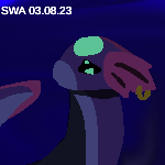
Hey! Something weird happened with my header thing after i went to a new thing. An image is attached.
 If it helps, I’m a mobile user and i am using that header code thingy.
If it helps, I’m a mobile user and i am using that header code thingy.The pfp was edited by us, it uses a official sprite of Chiaki Nanami from Danganronpa, and uses a coloring psd by kiochisato on tumblr


What was your goal in adding the header code? Are you using the one that sets the font size to 10pt? I think that was mainly meant for desktop, but depending on what your goal was there may be a few solutions.
Such as: I can help you write code that more specifically addresses your issue without side effects. Or if you use desktop as well and want to keep the code there but not on mobile, there's CSS that can limit by screen size. Or, the real quick and dirty fix, you could just hide overflow on the menu bar so it doesn't cause that extra space on the right.
I think this is the code for that last thing, it's what I'm using as a fix for a similar issue since I didn't like how squished the text looks on the menu on mobile. (But I'm on mobile so it's hard for me to verify right now heh)
#navigation {
overflow: hidden;
}


QUOTE originally posted by Mirzam
What was your goal in adding the header code? Are you using the one that sets the font size to 10pt? I think that was mainly meant for desktop, but depending on what your goal was there may be a few solutions.
Such as: I can help you write code that more specifically addresses your issue without side effects. Or if you use desktop as well and want to keep the code there but not on mobile, there's CSS that can limit by screen size. Or, the real quick and dirty fix, you could just hide overflow on the menu bar so it doesn't cause that extra space on the right.
I think this is the code for that last thing, it's what I'm using as a fix for a similar issue since I didn't like how squished the text looks on the menu on mobile. (But I'm on mobile so it's hard for me to verify right now heh)
#navigation {
overflow: hidden;
}

Is there any way to make text that's not in a container (like the thread titles on the thread's page) a different colour or give it an outline or something?
I ask because the background image I use has a somewhat dark section near the top and I prefer a "light mode" sort of style, with dark text, which makes it hard to read the titles. I don't think I can find another image that works with the theme, though, and I really don't want to make "dark mode" sort of style...
Stuff I'm after: An Ice Fang, any Maravol pattern I don't have, some shiny charms, Darecare passes or any currencies.


Signature by CatEnergetic, with help from Wardove. Art by PrincessPika.


QUOTE originally posted by PrìncèssPíká
Is there any way to make text that's not in a container (like the thread titles on the thread's page) a different colour or give it an outline or something?
I ask because the background image I use has a somewhat dark section near the top and I prefer a "light mode" sort of style, with dark text, which makes it hard to read the titles. I don't think I can find another image that works with the theme, though, and I really don't want to make "dark mode" sort of style...
PFP from BanG Dream! Girls Band Party; edited by girl's code

hi! I have a code I use in my shop
 Flame's PWYW Sprites
 (sorry idk how to do the 1 click highlights thingy)
I have been messing around with it myself but, I need help with the human sprite code, (Pixelb), atm to position it as sitting on the bottom, I have it in the top part and have to manually input the padding-top each time, due to different sized messages, is there a way to position it there automatically? thank you to anyone who helps, and I'll be fine if no-one does, i might figure it out on my own or continue manually inputting the padding each post.
(sorry idk how to do the 1 click highlights thingy)
I have been messing around with it myself but, I need help with the human sprite code, (Pixelb), atm to position it as sitting on the bottom, I have it in the top part and have to manually input the padding-top each time, due to different sized messages, is there a way to position it there automatically? thank you to anyone who helps, and I'll be fine if no-one does, i might figure it out on my own or continue manually inputting the padding each post.
show
The Quick Brown Fox
The Quick Brown Fox
credit | free to use, edited by me || human base
code
[sc=top][sc=Tart][img]https://i.imgur.com/S3e00zL.png[/img][/sc][size=14pt]Flame's PWYW Sprites[/size][sc=Pixelb][img]https://i.imgur.com/SnMvgXq.png[/img][/sc][/sc][
][sc=middle][stackbox][a-section=The Quick Brown Fox]The Quick Brown Fox[/a-section][/stackbox][/sc][
][sc=bottom][url=https://pfq.link/~LDxq]credit[/url] | free to use, edited by me || [url=https://www.deviantart.com/misuuri/art/Pokemon-Bases-285781031]human base[/url][/sc]
[style]
//colour coding - editable area
//change the colours, but make sure that the words are still legible
@toptext: #4CACF6;
@top: #002C6f;
@accent: #595959;
@text: #ABABAB;
@bkg: #333333;
//code, don't touch unless you know what you're doing
.top {
background: @top;
padding:10px;
font-size: 10pt;
height: 23px;
color:@toptext;
text-align: left;
a, a:visited { @toptext; }
}
.middle {
background: @bkg;
padding:10px;
min-height:7%;
color: @text;
text-align:center;
font-size: 11pt;
a, a:visited { @text;}
}
.bottom {
background: @top;
padding:10px;
max-height:auto;
color: @toptext;
text-align: right;
a, a:visited { color: @toptext; }
font-size: 10pt;
}
.Tart {
float: right;
height: 30px;
width: 35px;
border-style: solid;
border-color: transparent;
border-width: 1px;
}
.Pixelb {
text-align: left;
height: 30;
width: 35;
padding-top: 42px;
}
a {color: @accent;}
a:hover {letter-spacing: 2px; transition: all 1s; }
a:not(:hover){letter-spacing: 0px; transition: all 1s; }
.tooltip_content {
border: 0.5px solid @text;
background: @bkg;
min-width:1%;
width: fit-content;
color: @text;
font-size: 10pt;
padding: 5px;
}
.panel {
padding-top: 0px;
background-color: @text;
border: 1px solid @top;
border-radius:5px;
box-shadow: none;
width: 80%;
margin: 0 auto;
>h3 {
background: @toptext;
border: none;
border-bottom: 1px solid @top;
font-size:12pt;
color: @top;
font-weight:bold;
text-align: center;
padding:5px;}
>div {
color: @bkg;
padding: 5px;
}
}
.expbar {
padding: 5px;
background: @bkg;
color: @bkg;
border-radius: 0px;
width: 65%;
text-shadow:
1px 1px 0 @text,
-1px -1px 0 @text,
1px -1px 0 @text,
-1px 1px 0 @text,
1px 1px 0 @text;
border: 2px solid @accent;
}
.expbar div {
background: @accent;
border-right: 2px solid @accent
}
.expbar span {
color: @bkg;
}
.bbcode_table {
background: transparent;
border: 1px solid hidden;
}
table {
border: 4px solid @bkg;
padding: 4px;
border-collapse: separate;
th, td {
text-align: center;
padding: 5px;
border-radius: 8px;
border: 2px solid @accent;
color: @text;
}
th {
background-color: @accent;
color: @bkg;
}
td {
background-color: @bkg;
}
}
table {
margin: 0 auto;
}
.tabbed_interface {
border-collapse: separate;
>ul {
background: @bkg;
>li {
background: @accent;
color: black;
border: 1px solid @accent;
border-radius: 0px;
margin: 10px;
height: 15px;
font-size: 10pt;
min-width: 15%;
padding: 5px 0px;
text-align: center;
color: @bkg;
&.tab-active {
background: @bkg;
border: 1px solid @accent;
color: @text;
}
}
}
.tab, .tab-active {
background: @bkg;
color: @accent;
border: 1px solid @accent;
box-shadow: none;
}
}
hr {
width: 80%;
height: 0.5px;
border-radius: 10px;
background: @accent;
}
b,i{color: @accent;}
h1,h2{color: @accent;
font-size: 13pt;}
[/style]
Previous User: FireDanceCrystal | Call me: Flame
Hewo! Im Just A Playful Moltreon, Who Like's To Make Art!
I Am The One Who Made My Avatar, And My Shop Banners!
 ^^ Thats Me!
For all credits look in about me.
^^ Thats Me!
For all credits look in about me.
^^ Thats Me!
For all credits look in about me.
credit | free to use, edited by me || human base


Super simple fix, just move the code for your human pixel to after your text area, so right above the code for the bottom of your template.

"There's not a cup of tea big enough or a book long enough to suit me." - C.S. Lewis
| Avatar credits | ©
signature by emberlynn; official 1D fragrance commercial gifs

If I wanted to increase the clickable area for the field stacking CSS, which values should I adjust? I messed with it not too long ago but wasn't able to get it to adjust the way I hoped.
Scoured Delights, my trade shop!


Does anyone know if there's a way to make eggs stand out in the shelter if they were bred by a certain user? I'm trying to find ones i bred myself but it's very difficult to do so manually.
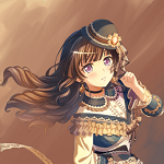
Avatar art by me! (@/pecha_berrie on IG)
Cannot post: Please log in to post