
Single post in Sprite Discovery Discussion
Forum Index > PokéFarm > Discussion > Sprite Discovery Discussion >


QUOTE originally posted by Çelestanê
Recently in pokemon Home the color changes slightly, with shiny trims being lighter than the ordinary coloration


 As you can see, the color on the model here is much lighter and desaturated than the sprites from the previous generation. It matches more closely to the Sugimori artwork:
 However, this seems to have changed starting with Pokémon Home, as the palettes for the regular colored Pokémon are updated on their Home renders to be brighter and more colorful (you can see this especially in the bulb here):
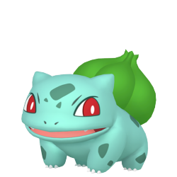 The color palettes on these updated Home renders match up with other official artworks of the Pokémon, such as the Global Link styled artwork, and even sometimes their sprites from Gen 5 (not so much for Bulbasaur here, since its exact colors have been inconsistent through the years, but it's easier to see on a Pokémon like Charmander [Home render])
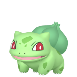
However, Pokémon Home did not apply this same color update to the Shiny renders, using the same desaturated palettes that X and Y used:
The color palettes on these updated Home renders match up with other official artworks of the Pokémon, such as the Global Link styled artwork, and even sometimes their sprites from Gen 5 (not so much for Bulbasaur here, since its exact colors have been inconsistent through the years, but it's easier to see on a Pokémon like Charmander [Home render])
However, Pokémon Home did not apply this same color update to the Shiny renders, using the same desaturated palettes that X and Y used:
 This is most easily noticeable with a Pokémon with black in its palette, has areas in its shiny that are the same as the regular Pokémon, or that has an open mouth. Generally speaking. these colors should not change between the shiny and the regular Pokémon, however Home seems to indicate they should, due to the regular render using updated colors and the Shiny render not.
Let's take a look at Pikachu:
This is most easily noticeable with a Pokémon with black in its palette, has areas in its shiny that are the same as the regular Pokémon, or that has an open mouth. Generally speaking. these colors should not change between the shiny and the regular Pokémon, however Home seems to indicate they should, due to the regular render using updated colors and the Shiny render not.
Let's take a look at Pikachu:

 The black ear tips and cheeks are waaaay lighter on the Shiny than the regular. Let's take a look at how they appear in Gens 6 and 7 and Sword and Shield:


 You'll notice the Shiny matches up a lot more with the desaturated palettes of these games. The black on the ears of the regular Pikachu are lighter, making the lighter color of the Shiny's ear tips less extreme, and the cheek colors are actually supposed to be the same! For comparison, these are the Gen 5 sprites, once again showing that the cheeks should be much more visible on the Shiny than what is shown in the Home render:

 You'll also notice the inside of the mouth is different in Home too. This is also due to the regular sprites getting a recolor- in reality, these should stay the same between the Shiny and normal palettes! Here's Shellder, who has its tongue sticking out (you'll also notice the difference between the black colored parts in the Home renders too!):


 This all applies to Furfrou too. Due to the updated colors of the regular Home render, it makes it seem like the Shiny trims should have a lighter palette, when in actuality they should be the same color, as portrayed in previous games:

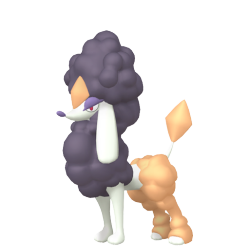
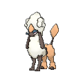
 The colors of the updated regular render matches official artwork as well as the minisprites for Furfrou, so the brighter orange seen here should also be the version used on the Shiny Diamond Trim (just as an example:)


 so yeah sorry for the long post, but tl;dr pokémon home shouldn't be the main reference for shiny colors because they are using inaccurate palettes for a lot of pokémon. thank u for ur time, join me next time when i overanalyze every single pokémon sprite that got absolutely destroyed in the transition from gen 5 to gen 6 /j
 shira//any pronouns//-4 server time
hunt journal
shira//any pronouns//-4 server time
hunt journal Collecting Teal Masks for future Ogerpon hunt! (1 so far)
pfp source | sprites from kirby super star