
Legibility / Template Rules
Forum Index > PokéFarm > Guides >


Legibility / Template Rules
Last edited: 2023 December 12
The Rules
Rule 7: Legibility
PokéFarm allows players to modify their About Mes, forum posts, and forum signatures through the use of both BBCode and CSS. Any changes made to background colour or font colour may not result in content that is a health hazard or causes pain to the viewer. What is considered "painful" can be subjective; if in doubt, report the content for review by the Moderator Team. In consideration for the health of the responding Moderator(s), if possible, please contain the "painful" content within a hidebox.
Intro & Checklist
This thread is an in-depth review of what template legibility is, why it is important, and the Moderator Team's stance on what is and isn't okay. Here's a quick checklist of what you should be checking your template for in order to ensure good legibility:Template Checklist
- Background colour
- Text colour
- Link colour
- Displays well in both full width and mobile width
- You can use Alt+1 or the 1 block display setting to check mobile width.
- Scroll bars are generally not permitted.
- Does not have multiple "modes," such as changing based on time or the user's light or dark theme settings
- This makes moderating for legibility multiple times more complex.
- Does not use a custom mouse cursor unless it is a private site skin
- Custom mouse cursors may not be used elsewhere.
- Any and all extra elements have been properly defined
- All art in use is credited properly
- The art crediting rules are here.
- You must have permission to use any art, images, or code that you didn't make yourself.
- If you did make it yourself, credit it anyway. Other people don't know you made it unless you tell them.
- A colour contrast of at least 4.5:1
- A contrast ratio of at least 7:1 is considered "ideal" in web design for legibility.
- Any colour use that results in pain or discomfort to look at should be avoided or used minimally, including neon or highly saturated colours. Whether a particular colour combination is too painful to use is up to Moderator discretion.
- Text size between 10pt and 15pt.
- Using pt is recommended over using px to define text sizes.
- Certain fonts are harder to read than others. When selecting fonts, keep in mind that cursive-based or niche fonts like Zalgo text may prevent viewers from reading your text.
Defining Colours
Defining colours properly is perhaps the most important part of making a template. Your colour choices must not result in harm to the person reading it regardless of what kind of site skin they are using. In most cases, having everything defined means you have a background colour, text colour, and link colour. Having accordions, display/hide boxes, tabbed layouts, pkmnpanels, etc. in your template mean that additional colour definitions will be required, but more on that later. Here is the code for a very basic defined template. .box1 { background-color: white; color: black; } a, a:visited { color: blue; }You can see a new set of background, text, and link colours.
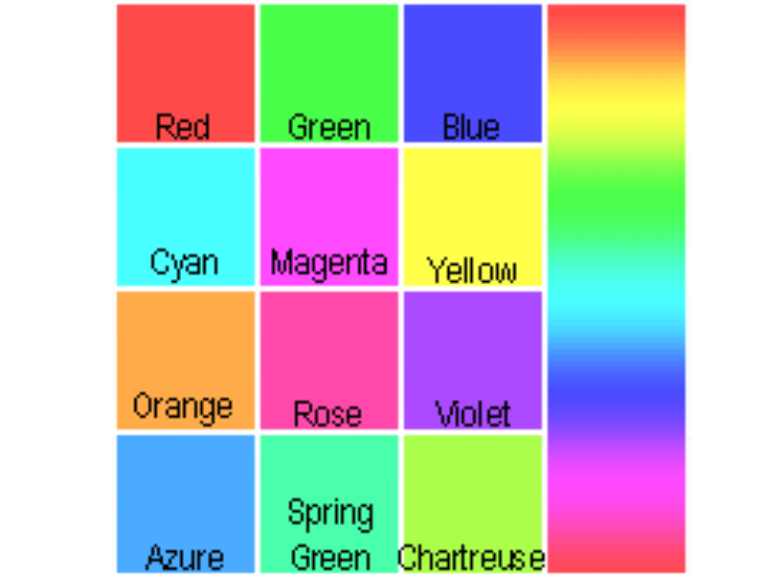
Keep in mind that some colour combinations can cause harm to the viewer, and other combinations may be difficult to read. If you are unsure whether others might find your colour combination difficult to read, you can use this tool to determine your contrast ratio. The higher the first number in your contrast ratio, the easier your combination is to read. Avoid using colours that have maximum saturation. Notably bad examples of maximum saturation colours that can cause eye strain and even pain are red, cyan, and neon green.
Red
Having red as a background colour with black text can cause significant eye strain.
Cyan
Cyan backgrounds paired with black text is a similarly strong colour that can easily hurt the reader's eyes.
Neon Green
Neon green carries many of the same issues, giving what we call an "eye-burning" effect.
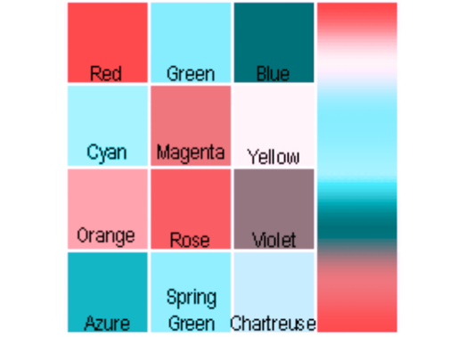
Colourblindness simulations
Original
 Red-blind (Protanopia)
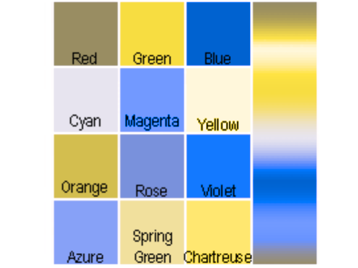 Green-blind (Deutanopia)
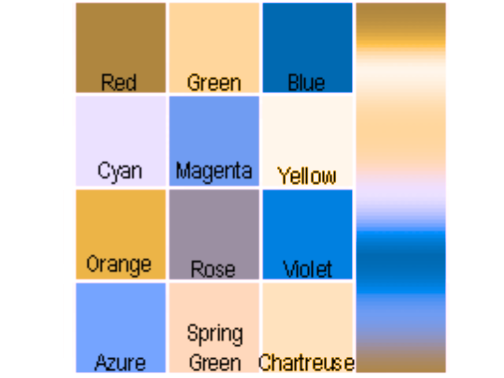 Blue-blind (Tritanopia)
Red-blind (Protanopia)
Green-blind (Deutanopia)
Blue-blind (Tritanopia)
Accessibility
Speaking of accessibility, custom mouse cursors are a fun way to customize your templates and site skins but they are not accessibility friendly. At this time here are the rules on custom mouse cursors: Site Skins: You may change the cursor for your own view as it does not affect other players gameplay or accessibility. You may NOT distribute a site skin with a custom mouse cursor. Templates: You may NOT change the mouse cursor to a custom cursor in templates of any form. This includes, but is not limited to, forum post templates, forum signatures, or About Me templates.Template Size
When making a template, it must be easily viewable on all devices. These devices come in different sizes, so your templates must be able to scale on any of them and remain legible. Likewise, the header (top) and the footer (bottom) of the template should not cause an excessive amount of scrolling just to reach the content. For this reason, the header and footer of a template should add up to be no more than 400px tall. The forum is built to display at different sizes across different device types, so your template may not easily be readable to someone else. As an example, some templates may be much too wide to display on mobile, and depending on how they're coded they may refuse to scale down properly.Some templates can be too wide
[style]
.panel {
background: black;
border: solid 1px white;
color: white;
> h3 {
> a {
color: white;
}
border: solid 1px white;
background: #6E6E6E;
color: white;
}
> div {
.page;
color: white;
a:link, a:visited {
color: #d1d1d1;
}
}
}
[/style]
The second is if and only if a table would be made more legible to mobile users by the addition of a horizontal scroll bar. A vertical scroll bar is disallowed for this purpose. Here is a table with an acceptably used horizontal scroll bar.
| Header | Header | Header | Header | Header | Header | Header | Header | Header | |
|---|---|---|---|---|---|---|---|---|---|
| Header | Data | Data | Data | Data | Data | Data | Data | Data | Data |
| Header | Data | Data | Data | Data | Data | Data | Data | Data | Data |
| Header | Data | Data | Data | Data | Data | Data | Data | Data | Data |
A Note
While it's okay to dictate that users may or may not edit your code, there is one very important thing to keep in mind: A user's disallowance for edits cannot supersede the need for edits to be made for the sake of site rule or legibility compliance. That is to say, you may not stop someone from editing your code if your code breaks the rules in any way and their edits would fix it so they don't get in trouble for using that code. These edits should be restricted to adjusting only text colours or sizes, or adding art credits, but should not be significant template-redefining changes if changes are disallowed by the template creator. In the case that significant changes would have to be made in order to fix a template from a rules perspective, it should be removed rather than edited. Likewise, if you are pushing minor fixes on a template in order to fix the legibility of it, please report the original template so that moderators can ask the creator to fix it. This is so nobody else has or gets in trouble for those issues.Advanced Features: Template Modes
Code exists to add multiple "modes" or variations to a single template, but please note that doing so is disallowed. A template must not change according to variables such as the site's current time, the viewer's light or dark theme settings, and so on. While this being done correctly would be a creative and interesting way to express oneself, it is more often than not extremely difficult to code a single fully legible template on the first try. Even veteran coders who have made many templates sometimes miss things. I've made a number of templates myself and missed things. Going through the legibility rules and correcting those issues takes lots of time, and so does working with users in order to correct their mistakes with their templates. It is one of the most time-consuming reports for a moderator to take because we have to allow the users a chance to fix their templates themselves, corresponding back and forth to tell them whether or not there are still issues, or if new issues have come up in the changed code. For the sake of preventing undue stress to the Moderator Team from time investment requirements of legibility reports, this kind of template may not be used.
 for Market equiv.

sig code and sig bg image made by me
Other elements and ensuring they are defined
Here is a collection of codes which have certain elements completely defined in black, white and grey for easy reference and usage. Some of these codes will have duplicated things like link colours, but I have done this because if you haven't already defined those colours, you need to for these codes.Accordions, Stackboxes, Hide Boxes and Display boxes
As you can see by this post, these boxes have all been define with very plain colours, but defined all the same.
code
[style]
.panel {
background: black;
border: solid 1px white;
color: white;
> h3 {
> a {
color: white;
}
border: solid 1px white;
background: #6E6E6E;
color: white;
}
> div {
color: white;
a:link, a:visited {
color: #d1d1d1;
}
}
}
[/style]
Progress Bars
Progress Bars are great for tracking items, hunts or any number of things. Since progress bars often take their colours from the rest of the template used, if you are going to use one, make sure you have defined everything in it as well
code
[style]
.expbar {
background: black;
color: white;
border: solid 1px white;
> div {
background: #6E6E6E;
border-right: solid 1px pink;
}
}
[/style]
Tool Tips
Tool tips are those little boxes that pop up when you hover over something, these can be tricky but once again, they often take their colours from the rest of a template and will need to be defined as well.
Also be aware that a tooltip at the bottom of a signature or post may be cut off, so check your codes before posting them.
Hover here.
Everything is defined and easy to read
code
[style]
div.tooltip_content {
background: black;
color: white;
border: solid 1px white;
}
.bbcode_tooltip {
border-bottom: 1px dotted #6E6E6E;
}
[/style]
Tables
Tables are great for organisation of hunts, shop stock, or any number of other things. They generally take their text colour from the rest of the template they are used in and will need to be defined as well.
Completely defined table
| Header 1 | Header 2 | Header 3 |
|---|---|---|
| cell 1 | cell 2 | cell 3 |
| cell 4 | cell 5 | cell 6 |
code
[style]
table {
border: solid 1px white;
}
table th {
border: solid 1px white;
color: white;
background: #6E6E6E;
border: solid 1px white;
}
table td {
border: solid 1px white;
background: black;
color: white;
}
[/style]
PKMN Panels
PKMN Panels are fun little display codes for your special pokemon. This code includes some duplicate codes for tooltips and link colours as they are required by the boxes themselves.

 27%
27%


Aspear Berry


Aspear Berry (SOUR)
Cheri BerryCheri Berry (SPICY)
Chesto BerryChesto Berry (DRY)
Pecha BerryPecha Berry (SWEET)
Rawst BerryRawst Berry (BITTER)
Likes:
Spicy food
27%Adamant nature
Code
[style].party > div {
background: black;
color: white;
border: 1px solid white;
box-shadow: 3px 3px 3px pink;
a:link, a:visited {
color: pink;
}
.action > .berrybuttons[data-up='sour'] > [data-berry='aspear'],
.action > .berrybuttons[data-up='spicy'] > [data-berry='cheri'],
.action > .berrybuttons[data-up='dry'] > [data-berry='chesto'],
.action > .berrybuttons[data-up='sweet'] > [data-berry='pecha'],
.action > .berrybuttons[data-up='bitter'] > [data-berry='rawst'] {
background: white;
}
.action > .berrybuttons[data-down='sour'] > [data-berry='aspear'],
.action > .berrybuttons[data-down='spicy'] > [data-berry='cheri'],
.action > .berrybuttons[data-down='dry'] > [data-berry='chesto'],
.action > .berrybuttons[data-down='sweet'] > [data-berry='pecha'],
.action > .berrybuttons[data-down='bitter'] > [data-berry='rawst'] {
background: grey;
}
.action a[data-berry]:after {
border: 2px solid white;
}
.pkmn:before {
border: solid #6E6E6E;
background-color: white;
}
.expbar {
border: solid 1px white;
color: white;
background: black;
>div {
background: #6E6E6E;
border-right: solid 1px pink;
}
}
div.tooltip_content {
background: black;
color: white;
border: solid 1px white;
}
.bbcode_tooltip {
border-bottom: 1px dotted black;
}
}[/style]
Wide tables
The code used to make a wide table mobile-friendly is as follows:
[style]table {
display: block;
width: 100%;
overflow-x: auto;
}[/style]
It is highly recommended to use CSS Grid instead, but that is not something that this guide will go into.
Cannot post: Please log in to post