
Upcoming Nav-Bar Changes (Preliminary)
Forum Index > Core > Announcements > News Archive >
![Garthic [Jamie]'s Avatar](https://pokefarm.com/upload/Novan-chan/Avatars/bdy_garth.png)


Original post
Hello all~
We've been looking over the NavBar for the past while and we've been looking to make some improvements.
We've bounced the ideas around with staff thus far but it's come to the point where we're looking to start informing you guys and garnering feedback.
So, let's start this off with a quick top-bottom comparison!
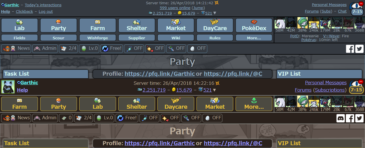 So the primary difference you may notice is that things have generally been cleared up, the text has all been standardised to 16px (12pt) but lets take this left to right on the top first!
So, first and foremost, you can see your own avatar - clicking it open up a small "mini-menu", as such -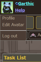 the "Profile" link will take you to your profile (shocking, I know! :p) and the "Edit Avatar" link will take you to the relevant page which will allow you to... Well, edit your avatar!
The "Help" and "Logout" links still do the same thing, but the "Clickback" link has been removed - more on that later!
Now on to the middle - the information displayed has been cut down and the text size has been increased to aid in legibility, as we were actually failing to meet the legibility guidelines that are set out for websites, something we've been trying to work on fixing for quite some time now!
(Note that these guidelines aren't "for everyone", the idea behind them is simply that it allows more people the comfort of visibility without making it too much of an eyesore. I'm sure it'll be too big for some and still too small for others, but we're looking for the happiest little medium we can find.)
The "Users online" and the "Jump" button have been re-located to the "More..." button, more on that later.
And finally, on the right! The "Chat"-link has been removed as there is no longer any use for it - instead, as you can see, there's simply a Discord image next to the Facebook and Twitter image-links.
The remaining links, "Personal Messages" and "Forums"/"Subscriptions" have had their text size increased, and "subs" now says the full word.
Yay for legibility! :D
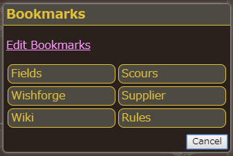
The Bookmarks have been moved to the "More..." button, more on that soon.
The Timers bar has been cleaned up a little bit and your number of interactions can be seen (this is the button to the right of "Admin" that says "0"), when you click on that you are taken to your interactions page. For reference, that is this page.
And since I've been mentioning that little "More..." button over and over, let's get on with showing that to you now, shall we?
the "Profile" link will take you to your profile (shocking, I know! :p) and the "Edit Avatar" link will take you to the relevant page which will allow you to... Well, edit your avatar!
The "Help" and "Logout" links still do the same thing, but the "Clickback" link has been removed - more on that later!
Now on to the middle - the information displayed has been cut down and the text size has been increased to aid in legibility, as we were actually failing to meet the legibility guidelines that are set out for websites, something we've been trying to work on fixing for quite some time now!
(Note that these guidelines aren't "for everyone", the idea behind them is simply that it allows more people the comfort of visibility without making it too much of an eyesore. I'm sure it'll be too big for some and still too small for others, but we're looking for the happiest little medium we can find.)
The "Users online" and the "Jump" button have been re-located to the "More..." button, more on that later.
And finally, on the right! The "Chat"-link has been removed as there is no longer any use for it - instead, as you can see, there's simply a Discord image next to the Facebook and Twitter image-links.
The remaining links, "Personal Messages" and "Forums"/"Subscriptions" have had their text size increased, and "subs" now says the full word.
Yay for legibility! :D
The Bookmarks have been moved to the "More..." button, more on that soon.
The Timers bar has been cleaned up a little bit and your number of interactions can be seen (this is the button to the right of "Admin" that says "0"), when you click on that you are taken to your interactions page. For reference, that is this page.
And since I've been mentioning that little "More..." button over and over, let's get on with showing that to you now, shall we?
 So, it's pretty self-explanatory but, for the sake of argument...
The idea behind this is that it frees up an amount of space (as seen in the comparison) by taking some of the less time-sensitive information and placing it in one handy little pop-up.
You still get your bookmarks through this, they're still much more accessible than navigating to them through the standard method although we acknowledge that having it being one extra button press away is something we expect people to have issue with.
We're not certain about having the Pokérus information there but the reasoning at this moment in time for that is that there's a small minority of people that go for the 'rus at any given time, thus it seems a bit weird that the time is sort of shoved in everyone else's face, despite the fact most people simply don't care for it (whether due to time constraints, preferring other clicking methods etc).
There's a concern with this as well in a simple concept - "Out of sight, out of mind" - with such a small minority of people hunting for it, moving it out of the way is liable to only exacerbate that reality, which is something we're not certain about.
That said! we also think that the 'rus is due a change. What change? We're not sure at this time, but with that said, the fact is that said change could involve that specific information no longer being particularly pertinent or relevant to being known - but it's not hard to move that information about (or remove it entirely or put it back...) so it's not like we're really "for" or "against" anything here. It's just a thought we've had and we figured it'd be best to show you the change, rather than just trying to describe it :D
Ultimately, we're looking for thoughts and feedback here.
As the announcement states, these are all preliminary changes and we're not looking to go implementing these right away, so there's no need to worry about that :)
Quick update:
Just as an example of swapping things around, it is possible for us to do things like:
So, it's pretty self-explanatory but, for the sake of argument...
The idea behind this is that it frees up an amount of space (as seen in the comparison) by taking some of the less time-sensitive information and placing it in one handy little pop-up.
You still get your bookmarks through this, they're still much more accessible than navigating to them through the standard method although we acknowledge that having it being one extra button press away is something we expect people to have issue with.
We're not certain about having the Pokérus information there but the reasoning at this moment in time for that is that there's a small minority of people that go for the 'rus at any given time, thus it seems a bit weird that the time is sort of shoved in everyone else's face, despite the fact most people simply don't care for it (whether due to time constraints, preferring other clicking methods etc).
There's a concern with this as well in a simple concept - "Out of sight, out of mind" - with such a small minority of people hunting for it, moving it out of the way is liable to only exacerbate that reality, which is something we're not certain about.
That said! we also think that the 'rus is due a change. What change? We're not sure at this time, but with that said, the fact is that said change could involve that specific information no longer being particularly pertinent or relevant to being known - but it's not hard to move that information about (or remove it entirely or put it back...) so it's not like we're really "for" or "against" anything here. It's just a thought we've had and we figured it'd be best to show you the change, rather than just trying to describe it :D
Ultimately, we're looking for thoughts and feedback here.
As the announcement states, these are all preliminary changes and we're not looking to go implementing these right away, so there's no need to worry about that :)
Quick update:
Just as an example of swapping things around, it is possible for us to do things like:
 (Users online in usual place, currencies in "More..." tab)
If that is what people would prefer.
Still not finalised, merely an example!
(Users online in usual place, currencies in "More..." tab)
If that is what people would prefer.
Still not finalised, merely an example!
So the primary difference you may notice is that things have generally been cleared up, the text has all been standardised to 16px (12pt) but lets take this left to right on the top first!So, first and foremost, you can see your own avatar - clicking it open up a small "mini-menu", as such -
the "Profile" link will take you to your profile (shocking, I know! :p) and the "Edit Avatar" link will take you to the relevant page which will allow you to... Well, edit your avatar!
The "Help" and "Logout" links still do the same thing, but the "Clickback" link has been removed - more on that later!
Now on to the middle - the information displayed has been cut down and the text size has been increased to aid in legibility, as we were actually failing to meet the legibility guidelines that are set out for websites, something we've been trying to work on fixing for quite some time now!
(Note that these guidelines aren't "for everyone", the idea behind them is simply that it allows more people the comfort of visibility without making it too much of an eyesore. I'm sure it'll be too big for some and still too small for others, but we're looking for the happiest little medium we can find.)
The "Users online" and the "Jump" button have been re-located to the "More..." button, more on that later.
And finally, on the right! The "Chat"-link has been removed as there is no longer any use for it - instead, as you can see, there's simply a Discord image next to the Facebook and Twitter image-links.
The remaining links, "Personal Messages" and "Forums"/"Subscriptions" have had their text size increased, and "subs" now says the full word.
Yay for legibility! :D
The Bookmarks have been moved to the "More..." button, more on that soon.
The Timers bar has been cleaned up a little bit and your number of interactions can be seen (this is the button to the right of "Admin" that says "0"), when you click on that you are taken to your interactions page. For reference, that is this page.
And since I've been mentioning that little "More..." button over and over, let's get on with showing that to you now, shall we?
So, it's pretty self-explanatory but, for the sake of argument...
The idea behind this is that it frees up an amount of space (as seen in the comparison) by taking some of the less time-sensitive information and placing it in one handy little pop-up.
You still get your bookmarks through this, they're still much more accessible than navigating to them through the standard method although we acknowledge that having it being one extra button press away is something we expect people to have issue with.
We're not certain about having the Pokérus information there but the reasoning at this moment in time for that is that there's a small minority of people that go for the 'rus at any given time, thus it seems a bit weird that the time is sort of shoved in everyone else's face, despite the fact most people simply don't care for it (whether due to time constraints, preferring other clicking methods etc).
There's a concern with this as well in a simple concept - "Out of sight, out of mind" - with such a small minority of people hunting for it, moving it out of the way is liable to only exacerbate that reality, which is something we're not certain about.
That said! we also think that the 'rus is due a change. What change? We're not sure at this time, but with that said, the fact is that said change could involve that specific information no longer being particularly pertinent or relevant to being known - but it's not hard to move that information about (or remove it entirely or put it back...) so it's not like we're really "for" or "against" anything here. It's just a thought we've had and we figured it'd be best to show you the change, rather than just trying to describe it :D
Ultimately, we're looking for thoughts and feedback here.
As the announcement states, these are all preliminary changes and we're not looking to go implementing these right away, so there's no need to worry about that :)
Quick update:
Just as an example of swapping things around, it is possible for us to do things like:
(Users online in usual place, currencies in "More..." tab)
If that is what people would prefer.
Still not finalised, merely an example!Hello again! Time for part 2 :D So we've made some adjustments based on the feedback given and I'm going to explain exactly what we did here and why. As I'm sure you can tell, we went to an extreme. Purely minimalist. Through this change we found out what people liked about the current Nav-Bar because, as evidenced, when things people like go away - they say so. Also, in truth, we didn't actually know what people particularly liked or disliked about the current Nav-Bar. We had guesses and theories about what people were willing to sacrifice or make compromises with. What did people straight-up not want to go away? Things like that were what we wanted concrete answers to. Granted, some of the answers were, in hindsight, relatively obvious - but it doesn't hurt to avoid making assumptions where it is possible for you to do so... So here we are. That all said, here's the concept that we've drafted up after taking in to account the feedback given. I'll bulletpoint some quick notes after the relevant screenshot to do a quick run-through because, truth be told, I am very tired xD
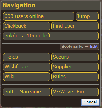
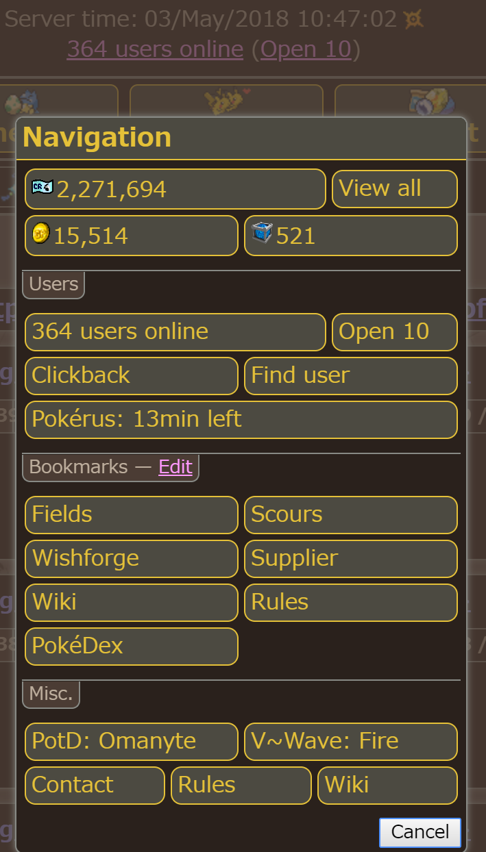
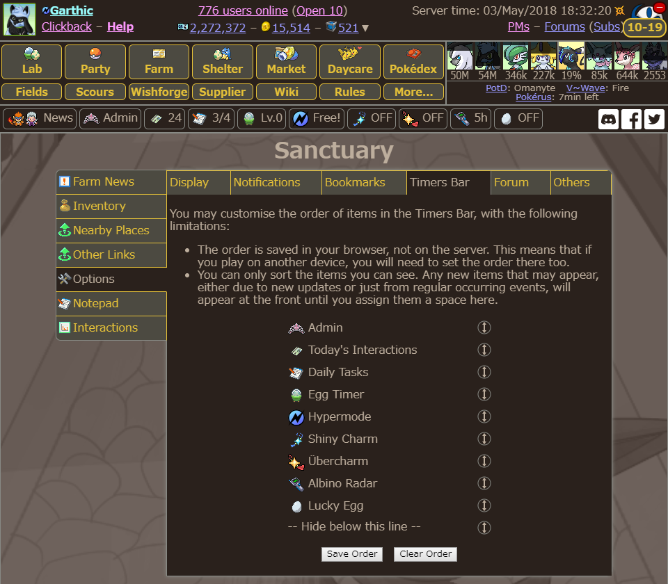 • Nav-Bar is back to how it is right now with the bookmarks being editable as-is, in the order they are presently in. These may become editable in terms of position at a later point but they server their function for the time-being. It's unlikely that the main buttons will be ones you can necessarily change, while there was some advocation for this, it did seem to come due to the lack of the additional bookmarks - and since that's not the case anymore, we've decided it'd be best to keep a "core" set of links and then have the additional ones that you, the user, can edit.
• Avatar/name system has been put in to place as previously shown. It includes "Profile" / "My Fields" / "Edit Avatar" and "Log out".
• As previously mentioned, the Bookmarks are fully editable, as per before.
• You can now have more than 6 bookmarks - if there's somewhere you normally have to spend a few clicks getting to, you can now "Bookmark" it, press the "More..." button, and you have additional bookmarks stored there. Here is an image of the "More..." button in action -
• Nav-Bar is back to how it is right now with the bookmarks being editable as-is, in the order they are presently in. These may become editable in terms of position at a later point but they server their function for the time-being. It's unlikely that the main buttons will be ones you can necessarily change, while there was some advocation for this, it did seem to come due to the lack of the additional bookmarks - and since that's not the case anymore, we've decided it'd be best to keep a "core" set of links and then have the additional ones that you, the user, can edit.
• Avatar/name system has been put in to place as previously shown. It includes "Profile" / "My Fields" / "Edit Avatar" and "Log out".
• As previously mentioned, the Bookmarks are fully editable, as per before.
• You can now have more than 6 bookmarks - if there's somewhere you normally have to spend a few clicks getting to, you can now "Bookmark" it, press the "More..." button, and you have additional bookmarks stored there. Here is an image of the "More..." button in action -
 (Nice and simple)
• The Timers Bar is fully editable, as previously discussed / mentioned. You can now hide Timers that you do not wish to do see. We've known of people doing this with CSS for a while now and we figured... Why not make it an actual thing? People evidently want it!
• Text has been made bigger, per the accessibility wants that we put forward previously. This has required us to move about the information on the top of the Nav-Bar but we have managed to make it work without sacrificing any of the information that people put forward as info they were concerned about not having visible.
Today's Interactions can be located on the Timers bar, if you wish for that.
Multi-profile click-backs can be quickly accessed from the aptly titled "Clickback" button.
The "Jump" (hereby "Open 10") button functions the same as always.
The users online list functions same as always.
(Nice and simple)
• The Timers Bar is fully editable, as previously discussed / mentioned. You can now hide Timers that you do not wish to do see. We've known of people doing this with CSS for a while now and we figured... Why not make it an actual thing? People evidently want it!
• Text has been made bigger, per the accessibility wants that we put forward previously. This has required us to move about the information on the top of the Nav-Bar but we have managed to make it work without sacrificing any of the information that people put forward as info they were concerned about not having visible.
Today's Interactions can be located on the Timers bar, if you wish for that.
Multi-profile click-backs can be quickly accessed from the aptly titled "Clickback" button.
The "Jump" (hereby "Open 10") button functions the same as always.
The users online list functions same as always.
I admittedly may have missed something here because I am very tired, but I wanted to get this out to you guys so we could continue moving forward. The screenshot provided shows you what the ordering looks like for the Timers bar. I'll be honest, I wanted to show that off and say nothing and just tease. But this took far too long and I'm just worn out xD Sorry I'm so boring :p I look forward to seeing your feedback in the morning <3

I luv the look of it and it sounds good. For me, I dont care as long as i can find what i am looking for.


I love the addition of the avatar in the corner (gonna make it so much easier to change my avatar)! Overall this seems like a very good idea, I don't really have any suggestions for other improvements to it. It seems like it's gonna be a little harder to accidentally click the log out button, and I appreciate that.
Icon by 7GROVEY on Twitter, for my use.
I wrote a Fanfic!

It's not that big of a change, so I think most people will be fine with it
I love the avatar in the corner thing :D
Edit:I just realized what bookmarks are...oh no! Please don't hide them away! I'm too lazy for that :P

I like the new layout idea Garth! im excited to see it implemented!
Avatar credits
Avatar was made on a site called Dress to Impress its a fan site for neopets.com and the image is a customization of a white lupe i made on D.T.I.

Everything looks lovely, except moving the Jump button to the 'More'. I really don't agree with this and think something needs to be discussed about this. The whole point of Jump is to get a quick few profiles- I don't think it's a good idea to make it more of a pain and add in an extra step. I'm not sure on how to give ways to improve this, but I think as it is now will deter a LOT of people (including myself). Perhaps put it under the avatar drop down? Make it bookmark accessible somehow? But make it something where users can get their Jump profiles quick. Just this small thing really makes the update less exciting since it's messing with a LARGE chunk of my daily activity.
EDIT: Just realized the bookmarks will not be on the main layout either. I'm really not liking hiding everything away. Honestly, I'd rather have the top 'cluttered' since I can get to where I want when I want.
 30zc
30zc  30zc
If you have questions, please read my
30zc
If you have questions, please read my 

Interesting.
But I honestly don't really like the idea to always clicking on "more" to go to my fields, my scour, using the jump button and for clickback...
EDIT : Also, I don't see the point of changing the order of the lab and all...
- Infos
- Collecting
Avatar by me
He is one of my most precious OC, you are NOT ALLOWED to use it !
~~
I'm French and not bilingual, but I try my best, so don't be too mad at me if my english is not very good, please :3
Priority


 |
|  |
|  |
|  |
|  |
|  |
|  |
|  |
|  |
|  |
|  |
|  |
| 
 |
|  |
|  |
|  |
|  |
|  |
| 
Raijin's_Lamp
33 | Hyperspace_Ring
36 | Ku_Idol
26
-----
| | | | | | | | | | | |
| | | | | | 


Ooh new cool looking changes :D It all looks awesome Garth!

 × 3 / 500
Yeah, that avatar-thing is a neat idea.
And I very much agree about 'rus; I don't hunt for it at all (never had rus) but I have tried a couple of times and personally I don't like how much effort I've got to put into it. I much rather use my interactions page or click on any of the mods' fields instead at my own pace.
Either way- I love all the changes shown so far and I hope they get even better. :D
Edit: just realized quite alot will be hidden behind "More..."
In case of fields, scours and wishforge, I disagree and feel they should be left somewhere else for easier access.

My first impression ist that the changes look very good and I like the thoughts you put into these changes made.
I am a bit reluctant to see the Bookmarks and the Pokérus links moved out of sight, but I love to see that anything I could say about this has already crossed your minds.
Changes always need some time to get used to, in my experience. But I'm absolutely willing to give it a try.

My username used to be Fuchsfee.
Just call me Fox.
 All images used for avatar and signature are recolors by me. Typerace icon made by myself. Only official game sprites used.
Cannot post: Please log in to post